This week I stepped into a formal Visual Design class for the first time. Design so far, has been a combination of instincts, osmosis learning from graphic designers, and a clear sense of the communication strategy.
According to WebMD, emotion transmits much more quickly than rational thought thanks to the quick response rate of the limbic part of the brain.
Visual design plays a supporting role in enabling understanding and making the right emotional connections. The components of a visual brand comprise of all the graphics, images and colors that transmit the brand in question.
Now let us look at the components of Hartford Promise’s digital assets including its website and social media channels. Hartford Promise is a 501(c)3 nonprofit that provides Hartford Public High School students funding and support to get them into college and through to graduation.
At its core, this is an organization that stands for opportunity and equity by putting college in reach for students who are economically oppressed. If we look at the organization’s digital assets including its website and social media channels, we get a sense for its message and visual presence.
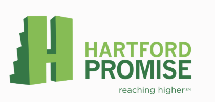
Hartford Promise: current logo

Hartford Promise’s logo looks similar to Minecraft gaming with its pixelated blocks behind the letter H. The logo looks to be applied consistently, with the exception of its Tik Tok account.
The tagline “Reaching Higher” aptly captures the essence of opportunity and expectations for student success. The tagline isn’t universally applied and it is very challenging to see in many social media channels, due to the exceptionally tiny font.
The color palette including the logo is very very green, which gives it an environmental flair. While this may work for some youth, it may not resonate as closely with all the businesses and individual donors that support Hartford Promise.
Hartford Promise is now in its tenth year, which seems like an excellent time to evaluate its brand against organizational growth plans. In the coming weeks I will take a closer look at individual elements of its visual design and share ideas to sharpen its visual persona in line with what I understand it wants to portray.

Responses to blog