-
Navigating College Pathways for Hartford’s Youth

As one of the most diverse towns in Connecticut, the city of Hartford has its fair share of challenges that radically affect the life of any teen who attends one of its three high schools. Chronic poverty, drug and alcohol addiction and daily obstacles make high school graduation, let alone college readiness, out of reach for many of its youth.
Hartford Public, Bulkeley and Weaver High School serve the city’s youth with a strong focus on improving academic outcomes and creating career pathways and community partnerships.
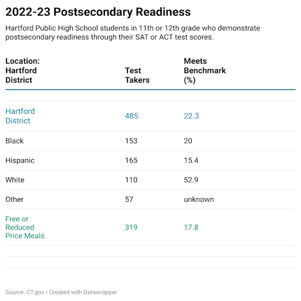
A look at Hartford District’s college readiness for 2022-23 as reported by the Connecticut State Department of Education based on standardized measures, shows black and Hispanic youth facing the biggest challenges:
Source: State Department of Education EdInsight. Table created using DataWrapper.
Hartford isn’t the only city facing this issue. According to College Board’s Trends in College Pricing and Student Aid 2024, enrollment in four-year U.S. degree programs for black, Hispanic and multiracial students, is mostly unchanged between 2015-2023:
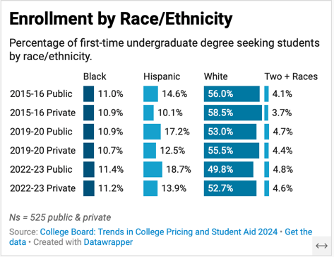
Source: Created using DataWrapper.
The report also finds that after adjusting for inflation, national college costs for 2024-25 are double what they were thirty years ago. A similar story plays out in Connecticut, with an exponential increase in published tuition and fees at private universities. Between 2014-2025, ct mirror reported that private universities increased their tuition by an average of $17,132 over ten years. UCONN increased its fees by $7,152 for in–state students.
Fortunately, there are many federal and institutional grants and loans available to Hartford’s youth to help forge pathways into a more affordable college education. Federal Pell Grants are one such example, issued to students who display exceptional financial need who have not yet earned their degree.
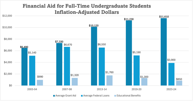
Source: CollegeBoard Trends in College Pricing and Student Aid 2024
The investment in attaining a four-year degree provides the critical thinking, soft skills, computer literacy and personal networks for high quality career opportunities. College graduates over the lifetime of their careers are more likely to work in positions that offer career development and financial benefits like health insurance and retirement savings programs.

Source: Bureau of Labor Statistics
Community College Track
Connecticut community colleges remain the most affordable way to fund an education, with published in-state tuition rates for 2025-26 at $692 for a three-credit class. While community colleges don’t necessarily offer a dynamic campus experience, it can be a good fit for a student who wants to live at home and commute to college.
Hartford: Home Base
A college education becomes even more meaningful when students return to Hartford to work and live. State run reimbursement programs can help new college grads payoff college debt more quickly so they can focus on other essentials like buying a car or saving for a down payment on a home.
Any pandemic related federal student loan protections are long gone and interest on outstanding student loans is accumulating for graduates. According to the Federal Reserve (Figure 34.), in 2024, 42 percent of people aged 18 – 29 who attended college took on student debt. Some are still paying off loans well into their forties.
State-run reimbursement programs can make a big dent in a person’s financial trajectory and the long-term economic welfare of a City like Hartford. In return, graduates work in Hartford for a designated timeframe, while they enjoy a high standard of living and give back to the community.
For parents, guardians and friends of a Hartford high school student considering college, a conversation with a teacher or guidance counselor is a good place to start.
If you or your teen is ready to begin exploring what colleges might be a strong fit, there are numerous online resources such as Niche that can help you to begin shortlisting colleges by the features most important to your situation.
-
Using Maps to Visualize Data

Using maps as a form of communication helps people determine where things are happening in a geographical context. They are ideal for comparing to other geographies and are frequently used to explain weather patterns and regional differences.
I recently heard a news story about redistricting before a census for the sole purpose of political gain. Maps are central to any political party, especially for analyzing voter demographics and showing people where the new lines fall.
Maps are also invaluable when disaster strikes. They quickly orient those affected by a catastrophe and help people in communities near and far to feel a sense of unity. Take for example the recent Texas floods, which devastated specific counties and captured the nation’s attention for several days.
This CBS news story from July 2025 incorporates several detailed maps to show the most impacted areas.
Dabbling with Datawrapper
It took me time to come to grips with DataWrapper, a powerful online mapping tool. It has an enormous library of maps and geographical presets that make it easy to grab and tailor almost any map.
Below are some of the initial maps I created in DataWrapper, the first one being a choropleth map. This one was the most intuitive to create and enabled the selection of different colors to represent ranges of access:
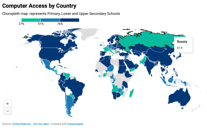
Digital economy: percent of computer access in schools by country.
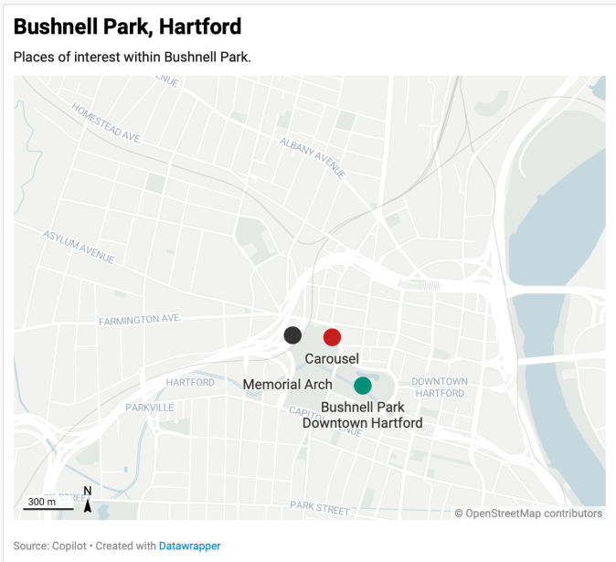
Bushnell Park, Hartford: A locator map highlights three key attractions and a glimpse into the city’s public spaces.
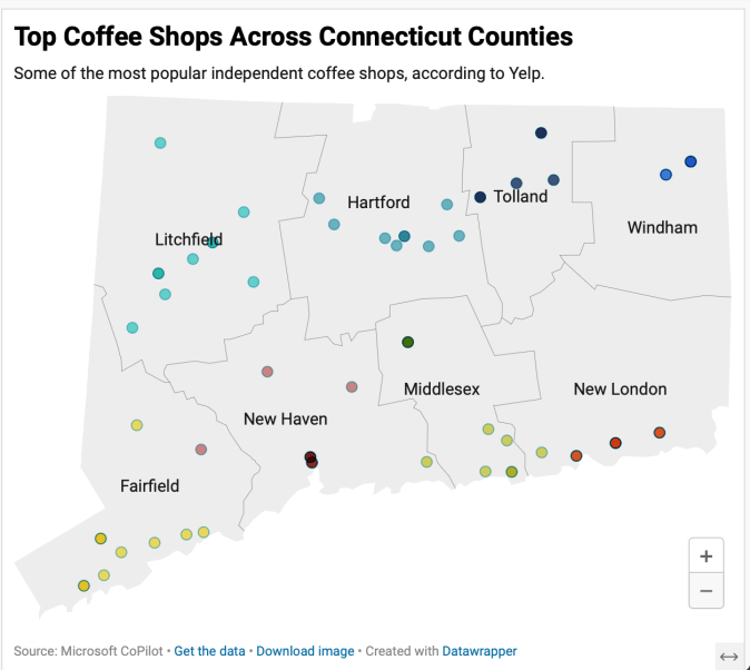
Mapping CT Perkatories: Independent coffee shops provide a convening spot for friends and those looking for ambiance.
While not yet dynamic, you can imagine how impactful these become with more detail and if they were integrated into a mobile app.
My favorite feature in DataWrapper so far is the ability to customize virtually any kind of map. Since this is still exploratory, I selected only three locations of interest and dropped them onto the map in a more approximate versus specific way.
I attempted to add the hover feature to the coffee shop map, adding the name, address and web link and couldn’t make it happen.
Beyond illustrating facts, maps add an element of emotion to any story or news article. From flood zones to voting districts, maps show the bigger picture and help connect its readers to the world around.
-
Going Analog: Visualizing Personal Data
Dear Data began as an experiment between two transatlantic friends who wanted to get to know each other better. They did so by examining, drawing and packaging a different set of personal data each week, which they mailed to each other on a postcard.
Minus the constraints of technology, this form of visualization requires imagination and invites the viewer to linger. Consider it more information art than data visualization:
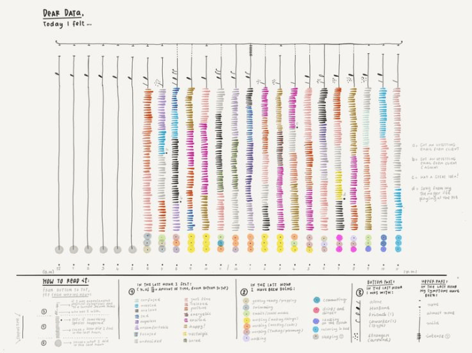
Source Pinterest: capturing emotions in color by hand. What is similar to data visualization, is the need for the feedback mechanism that allows people to share ‘real’ thoughts. Also essential is reviewing the data to consider what the information is telling you:
- Are there any surprising correlations between groups of information?
- Do you notice some patterns in the responses or written comments?
I found a topic to explore that allows for more white space in design: will meal timing help me lose a few pounds? For eleven days, I captured when and what I ate. The goal was to stick to my current diet within an eight-hour window, while fasting for sixteen.
Below is a hand drawn scatterplot that shows for the most part I’m sticking to the eight-hour food window allowed in intermittent fasting. It also shows that except for dinner where there is food on a plate, I’m very much a grazer, sipping on breakfast smoothies and snacking on nuts when I feel hungry, instead of eating on a set schedule.
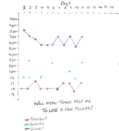
Scatterplot showing timing for breakfast, snacks & dinner While this may not be the most creative rendition, the scatterplot creates order and shares the information with white space. If I was really dropping this onto a postcard, it would be more decorative with food items written around the circumference of a clock and extra commentary around how it tasted. That’s what we do when telling stories.
In a business scenario where a person may be called in to design a research approach for say rating movie production companies, it would entail more refined decisions. This includes sorting information by movie genre, movie budget, location etc.
Regardless of the initiative or method, visualizations that are clear and factually accurate make for a much more pleasant reading experience. Personal information drawn with care, exceptional detail, and a dash of personality can nurture self awareness and build stronger friendships.
-
Effective Data Visualization

The art of data visualization is simplifying information or numbers through the creation of visuals that are easy for the viewer to understand.
Regardless of the type of analysis, knowing the communication goals, audiences, key conclusions and the format or venue is essential before turning anything into easy-to-grasp visuals. Any information captured should also be codified and analyzed:
- Exploratory analysis is an open-ended exploration to advance a business or personal goal. It can be ideation or qualitative feedback that informs what may become a more substantive research initiative. It can also be used after a quantitative study to understand one or two topics in greater detail.
- Statistical analysis is when you have a structured research initiative that yields data that can be presented as accurate within a high degree of confidence. This involves knowing population sizes and calculating required sample sizes. Results are often shared in formal settings.
Storytelling with data by Cole Nussbaumer Knaflic looks at a handful of some of the most effective data visual displays:
Vertical Bar Graph:
enables comparison between categories.
Horizontal Bar Graph: Easier to read because you see labels before the data.
Scatterplot: show relationships to see whether there is a correlation. 
Stacked Horizontal Graph: able to decipher first and last categories. 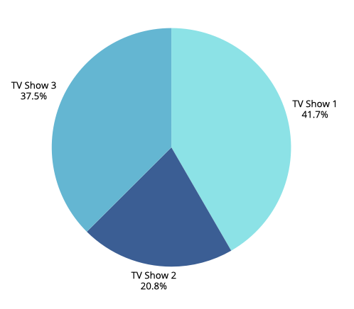
Pie Chart: data labels help viewers to assess segment sizes. 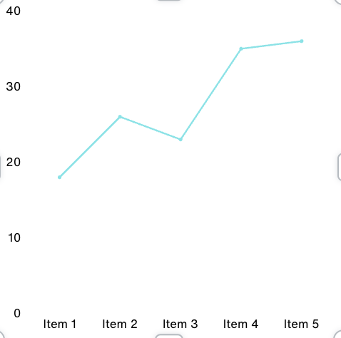
Line Graphs: used to plot continuous data over time. Exploratory Analysis: Dear Data
On the other end of the spectrum to data visualization is the graphing of personal information to reveal insights on habits or preferences. While you can never be definitive in what you conclude from a low volume individualized exercise like this, you can nevertheless create visuals that begin to show patterns over time.
I tracked mealtimes over the course of seven days to see if eating within an eight-hour window helps me to lose a few pounds. While I have found this quite doable, it is too early to say whether this will be an effective form of weight management in the long run.
Line graphs help to visualize information over units of time, in this case over the past week. By using different colors for breakfast, lunch and dinner, you quickly see the mealtime windows.

In the following YouTube presentation by David McCandless, this British data journalist and author demonstrates how presentation style augments what you see. The use of color and ragged mountain edges show the rapid shifts in public sentiment and relative fear factor that has swept over nations during prior national health crises. While he presents other oblique information that adds visual complexity, his relaxed and humorous presentation style makes this work.
There are multiple ways to visualize qualitative information and quantitative data. Which visualizations have you found most effective? By carefully selecting a visual format, you are well on your way to informing or inspiring those you wish to influence. When combined with a convincing speaker who engages the audience, data visualization can bring home a message, add levity or give them something to think about.
-
Accelerating Nonprofit Communications Using AI

Content creation is a big part of communications for 501(c) (3) organizations.
All nonprofits generate fundraising appeals and a website, so this week’s AI focus is to see what text and supporting images I can produce for very real potential scenarios:
- A fundraising appeal letter for a new NICU unit, which is part of a larger construction initiative currently underway at Connecticut Children’s.
- Website story for a fictitious children’s charity that needs to drum up volunteers to mentor inner city high school students.
There are a host of AI tools to choose from when it comes to large language models (LLMs) including Open AI’s GPT-4, which is also baked into Microsoft’s Copilot application. I looked around and found another promising one called Cohere Generate, a versatile language model for text generation. Another called Scribe, which didn’t appeal and then I came across Gemini AI, which is powered by Google’s “best family of large language models.” This sounded good, so I tried Gemini, logging in with my Google email credentials.
Art of Prompting
Knowing that large language processing models respond best when given a detailed prompt, I decided to write a specific request, putting AI in the position of playing the role of a communications officer working for a children’s charity with the fictitious name, Children Unite. The charity needs more volunteers to work with high school students, so the web copy needs to highlight real stories of the impact of mentors.
Below is the detailed prompt I developed and what emerged seconds later. In real situations, there may be a need to make more adjustments for accuracy and tone. In this case, I made just a few minor tweaks in italics below.
Prompt: Using Gemini AI to Recruit Volunteers
Imagine you are a communications officer working for a national children’s charity called Children Unite and you need to develop three paragraphs of creative copy for its website to solicit college age volunteers. The copy is a first-person account about a Hispanic high school student called Maria who lives in Hartford, Connecticut whose life was positively influenced by a mentor who met with her each week to discuss her aspirations and concerns. Include an example of how the mentor helped Maria overcome obstacles that would have prevented her from completing her high school education. As a result of this mentoring relationship, Maria finished high school, got a scholarship at the University of Connecticut and is now a math teacher at Weaver High School in Hartford. The copy concludes with a strong call-to-action to visit a volunteer page on the Children Unites website to complete a volunteer interest form.
Web Copy for a Children’s Charity using Google Gemini AI
I used to think college was a distant dream, something only happened to other people. I grew up in a tough neighborhood in Hartford, surrounded by challenges that made it hard to focus on school. But then I met Ms. {name}. She was my mentor through Children Unite. Every week, we’d talk about my hopes, fears, and everything in between. She helped me believe in myself when no one else did.
There was a time I was failing math and thinking about dropping out. {Name} didn’t give up on me. She tutored me, helped me find extra resources, and even connected me with a math teacher at a nearby college. With her support, I not only passed math but ended up graduating high school with honors. Because of Ms. {name} and Children Unite, I got a scholarship to UConn and now I’m a math teacher at Weaver High School in Hartford, giving back to my community.
Your guidance can change a life. Imagine being that mentor who inspires a young person to reach their full potential. Children Unite needs compassionate, dedicated college students like you to be mentors. By sharing your time and talents, you can help a child overcome obstacles and achieve their dreams.
Ready to step up? Visit our volunteer page to learn more and complete a volunteer interest form.
Depending on the organization, this may need more adjusting for tone and consistency. Overall, this was strong. Then I went whole hog and asked AI for some headline ideas. Here was my prompt and the options generated.
Headline Prompt
Please generate headline ideas and make them more specifically about the intrinsic benefits of being a mentor to a high school student that is from an inner-city environment.
The results are below, which are helpful and quite general:
- Unlock Your Potential as a Mentor: Shape a Young Life.
- Discover the Power of Mentorship: Guide a Student’s Journey.
- Create Lasting Impact: Be a Mentor to a Hartford Student.
- Invest in the Future: Mentor a High School Student Today.
- Experience the Rewarding Journey of Mentorship.
So, I’d take the ideas and write something specific along the lines of, “How one Children’s Unite Mentor Created a Lasting Impact”.
Using Copilot AI to Write an Appeal Letter for Connecticut Children’s
Next I turned to a real organization, Connecticut Children’s hospital and came across this news story. Imagining that building an 8-story tower for pediatric patients takes a lot of resources, the need for some fundraising isn’t hard to imagine. Honing in on the construction of the new NICU unit, I tried prompting AI a couple of different ways, with this as my final:
Prompt: Please write me a four-paragraph fundraising letter from Connecticut Children’s raising $150,000 for a new Neonatal Intensive Care Unit with 50 new private rooms that will provide 24/7 care to premature babies and those requiring constant observation. Hospital is pledging $1,000 to the first 50 families whose babies are treated in the NICU. There are two ways to give which should be bulleted out in the letter to stand out, which are paying online via https://connecticutchildrens.org/givehope or mail in payment using a no-postage necessary envelope. Keep the tone casual, grateful but not flowery.
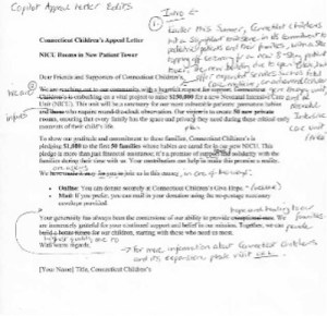
Adjacent is AI generated copy with my edits, which are to incorporate an introductory paragraph to explain background for the appeal. In retrospect, if I had provided AI more background information about the 8-story patient tower, it would have taken care of adding context.
A Picture is Worth a Thousand Words
We know the power of images to grab and hold attention in so many settings, including nonprofit digital channels. There are also many times when it is impractical or against policy to include the actual images of nonprofit participants, especially when it involves children.
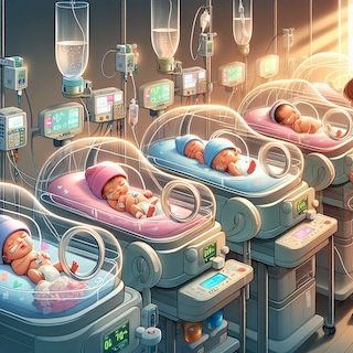
Kicking the tires of Microsoft Designer, the images shown below are somewhat endearing, but not as convincing as a real artist’s illustration of what the new NICU will offer. For me, this means more experimentation with AI to refine what can be produced and for any situation, imagery always needs to be in keeping with an organization’s brand.

Here were my prompts:
Prompt A – NICU:
An illustration of a NICU showing incubators with preterm or ill newborns. Each baby is wearing either a pink or baby blue hospital hat. Incubators are equipped with monitoring devices; IV stands and some babies have heart monitors or breathing tubes. A NICU nurse is tending to one of the infants. The light depicts warmth and safety.
Prompt B – Food Bank:
Create a photograph of an outdoor food assistance program with fresh produce in the foreground and a car in the background driving up with a food bank worker handing a bag of groceries to the person in the car. It’s a sunny day and there is a Food Bank sign.
The Next Industrial Revolution?
After dipping my toes into both the text and image generating applications, I’m thinking that the technologists are right about this being the biggest thing since sliced bread; at least in terms of what I have seen so far in terms of text generation. On the one hand, it’s exhilarating to think that creativity is given a huge boost by AI. Yet, it is a bit unnerving.
How we use AI and how well we dance with its strengths and limitations is in our hands.
-
Exploring Data Visualization

This week’s introduction to data visualization begins with a look at all the ways information can be displayed from bar charts to bubble charts, heat maps to flowcharts, line graphs, scatter plots and infographics. For the most part, the charts represent either an organization’s accomplishments, public or political viewpoints, and human interest stories.
Keeping in mind that good information visualization encourages the viewer to think about substance vs methodology, I began looking at charts developed well-known research and media organizations. A good chart should support what someone is saying or writing about so my perspective is to keep it legible and understandable.
Such as this example from the Guardian: How coronavirus spread globally, using open source information from John Hopkins data repository.
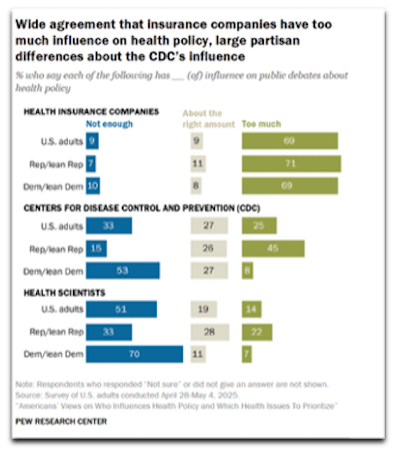
A visualized look at the start of what quickly became a worldwide epidemic. In the following Pew Research example regarding political and public sentiment concerning the degree of influence on public debates about health policy, there is huge bias in the headline and the chart requires scrutiny to find the question, legend and sample size. It misses what Edward Tufte, author of several statistical visualization books recommends in communicating “complex ideas with clarity, precision andefficiency”.
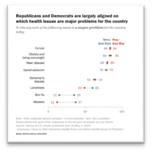
In contrast, the chart on the right efficiently depicts Partisan agreement on top U.S. health issues by displaying a combination of data points and color. Both are shown below for illustrative purposes only:
The upshot of all this data and analysis is we are overflowing with information. Ted Talk presenter Giorgia Lupi who runs a design firm reminds us that the numbers are never the point; it is more about highlighting information to close gaps and bring people closer together. Below she illustrates how she spends her time in extraordinary detail. In contrast to the media and business charts, this is a personal reflection piece that highlights she is generally happy, spends time with her husband and spends time talking on the phone and texting:

To break down information gathering on a personal level, I came up with three questions to track and illustrate over the coming weeks:
- Can I lose a few pounds?
- What does my garden oasis look like?
- What are effective forms of data visualization: media organizations vs. nonprofits?
Since you find lots of interesting geometric and informal shapes in nature, I chose to focus my attention initially on capturing potential plants/shrubs, including their common names, when they flower and their preferences for sun/shade. Now I can use this information gathering exercise in conjunction with other landscaping decisions.
Decoding the Ideal Garden
As you see from the initial sketch, the shapes combined with natural and vibrant colors, all contribute to what will eventually become a relaxing garden space, especially when the string lights are hung. I am not much of an artist so in this initial drawing, I only fit about a dozen plantings in this 4″ x 6″ space mapped against four Seasons. In the end, the aim is to have something in bloom each Season:
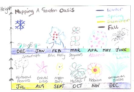
A 4″ x 6″ postcard: capturing when plants bloom This exercise seems to be more about capturing daily habits. I have a simple grid structure established on a separate sheet that I will use to track each question and sub-points. Imagining that I’m really going to be mailing 4” x 6” postcards with personal information about the above topics is going to require more ingenuity and sharpening of Oliver’s pencils.
-
Design for Impact

In a world fraught with short attention spans, less is always more in design. It calms the mind and provides a pleasing platform to gain a person’s attention.
This is the principle I applied to the development of email mastheads and stationery developed for the nonprofit Hartford Promise. It is an easy design assignment in that the information to be communicated is selective, including:
- Logo
- Name: Newsletter or Enews
- Image: Optional
- Date: Month, Year
With this in mind, I developed two design options for an eNews masthead. One centered and the other left aligned. I think the centered layout is more vibrant than the second and is a better choice. It also allows the organization to update the visual each month to reflect a key topic:


The font selection for the Hartford Promise logo is Alverata Informal, a Serif font. I incorporated one of the brand colors as the tag to complement the logo. Helvetica (LT Pro) is the Sans Serif typeface I selected for headlines and text. It has a clean and simple look that works here and when applied to digital situations.
In terms of business stationery, beginning with letterhead and business cards, I use the above typefaces and left alignment to produce the following. The branded green colors are used as a contrast to the black.

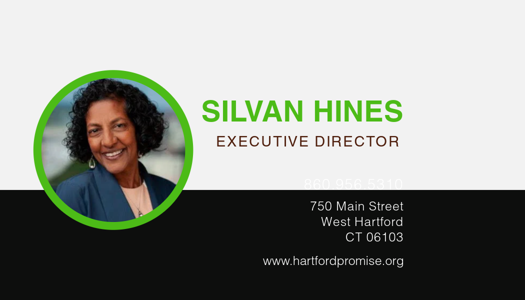

Above are just a few of the essential materials developed to sharpen Hartford Promise’s visual brand.
-
Evolving A Nonprofit’s Brand

Hartford Promise is a 501(c)3 that makes the dream of college a reality for hundreds of Hartford Public High School students who have what it takes to attend a four-year University.
Below you will find a brand review and recommendations for evolving its visual brand. For anyone in a development or communications role, this can be an insightful way to examine your brand.
The closest nonprofit of its kind that I found in the Hartford area is Hartford Youth Scholars, an organization that works with students beginning in middle school on long-term academic success, including college placement.
Brand Evolution
Hartford Promise has a youthful brand with a look and feel reminiscent of the Minecraft video game, popular with teenagers. Its tagline is hard to read in certain social media applications, most notably Instagram.
As the organization matures and continues to appeal to an increasing number of funders and donors, its visual brand needs to work for a more diverse demographic.
The following presentation shows how I suggest evolving Hartford Promise’s visual brand, including its logo, brand palette and typography.

Knowing that the long-term aim is for Hartford Promise Scholars to return to the area, there is also an opportunity to visually demonstrate the organization’s commitment to the City of Hartford.
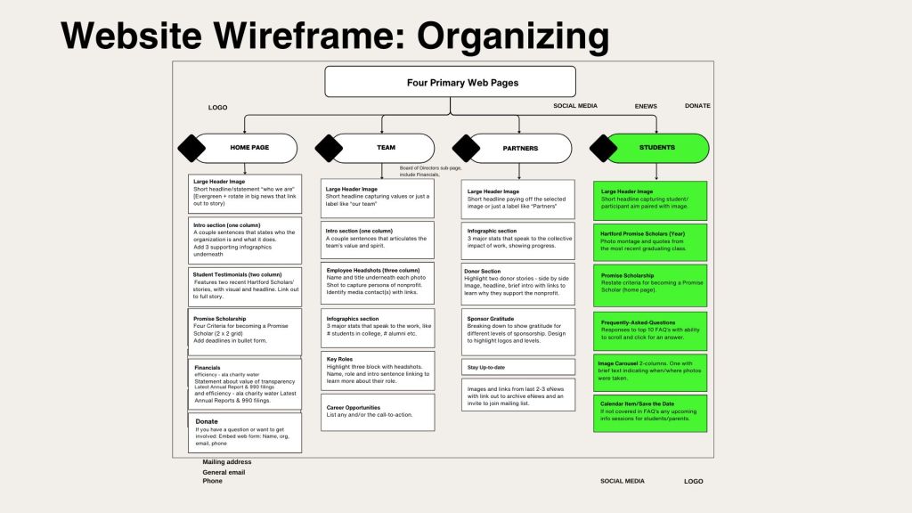
Website Wireframe
Outside of the visual brand, I reviewed the structure of Hartford Promise’s website and recommend organizing its content into four primary pages, with content categories listed on each page from top to bottom. This and the rationale is included in the above presentation.
Now in its tenth year, Hartford Promise is poised to strengthen its vibrant image and apply a consistent visual brand across multiple channels.
-
WordPress: Online Portfolio

There is a lot to consider in developing a tasteful online portfolio that shows what a person can do for a prospective employer or client. The emphasis of the portfolio I am designing highlights elements of each of the topics I have studied so far through Quinnipiac’s MA Interactive Communications & Media.
The structure of my portfolio is quite simple, comprising of three pages:
- About: professional experience and personal background (home page).
- Blog: summary of key blog posts, tagged by topic.
- Topics: key pages highlighting course material
Designing a portfolio requires a deeper understanding of all that WordPress has to offer and the building blocks that can bring a site to life. WordPress has been a challenging software program to learn and I am still figuring out how to work around its idiosyncrasies.
It is a mix of function and form thinking. This includes thinking through the best approach for organizing and presenting information on each page.
Design Building Blocks
In my earlier blog, Styling ‘On A Mission’ I made some decisions that will define the overall look and feel of my blog as well as the other above mentioned pages. These include using a font that is legible and easy to read online. There are several Sans Serif fonts including Libre Baskerville and Open Sans. For the large headers I looked for a Serif font and found one that pairs well: Playfair Display (H1)
Working with one of the preset templates in WordPress, I have adjusted the color palette that now comprises of black, light gray (#F3F6F6) and a royal blue (#11128B).
Armed with an outline of content, in the coming days, I need to build, build, build.
-
WordPress Duel
Right now, I am in the middle of a duel with WordPress.
After some progress making tweaks to the WordPress cast hub design in terms of fonts and color palette, I made updates to the home page structure through the WordPress pattern menu. This is situated in its editor, adjacent to the individual block function.
I cannot deny the frustration with a tool that doesn’t always operate in an intuitive fashion. On the bright side, the font I selected that would only work in lower case or upper case is now displaying as you would expect. Yah!
One hurdle cleared.
Putting aside the technical skills I’m working on at the moment, I turned back to the spreadsheet I created in the pre-work week. Here I reviewed the leg work completed before, while looking for inspiration at other portfolio sites.
Structure in Place
The WordPress blog will comprise of the primary blog page, named On A Mission at onamissioncomms.blog because of its focus on content that caters to nonprofit organizations.
The other sections of the site, including the About and Portfolio pages will be recreated on a WordPress site named juliasportfolio that will point to the On A Missions blog. While this isn’t the ideal because it requires two separate subscriptions, it is a good solution for this project’s requirements.
Portfolio pages will include:
- AI for nonprofits
- Premiere Pro Video
- Social Media Creative
- Visually Attuned
- Web Technologies (built once course completed)
WordPress presents as an incredibly intuitive website builder and it is, when it wants to work.
Today is not that day because recent progress has disappeared.
I need to exercise some self preservation and patience. Tomorrow is a new day.


Leave a comment