-
Maximizing Visual Impact for Connecticut Children’s
Before a designer can begin to put their visual skills to work, a creative brief is an essential input. While typically I have worked in roles where I am developing the creative input, this week I wore a graphics designer hat.
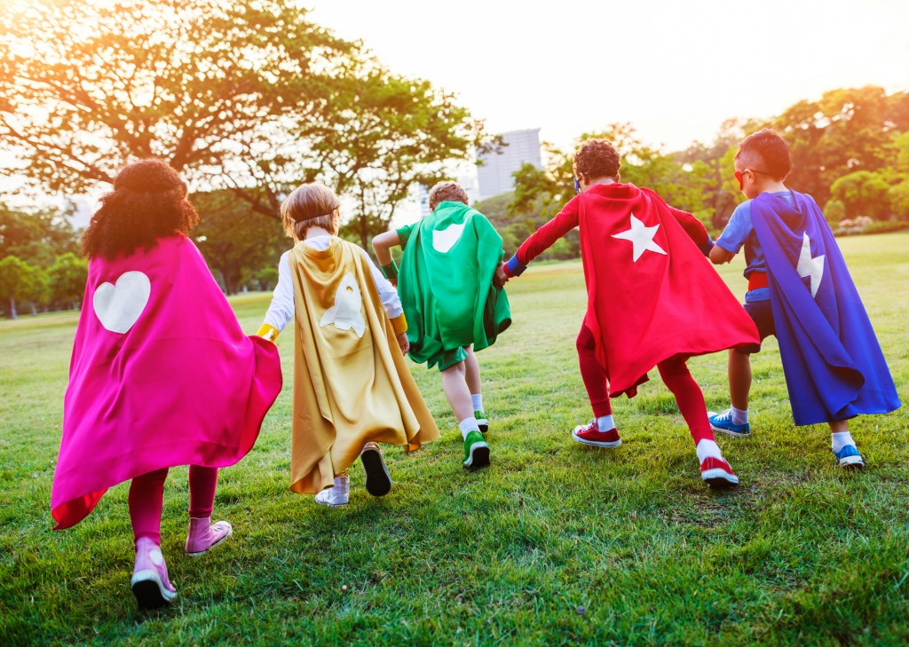
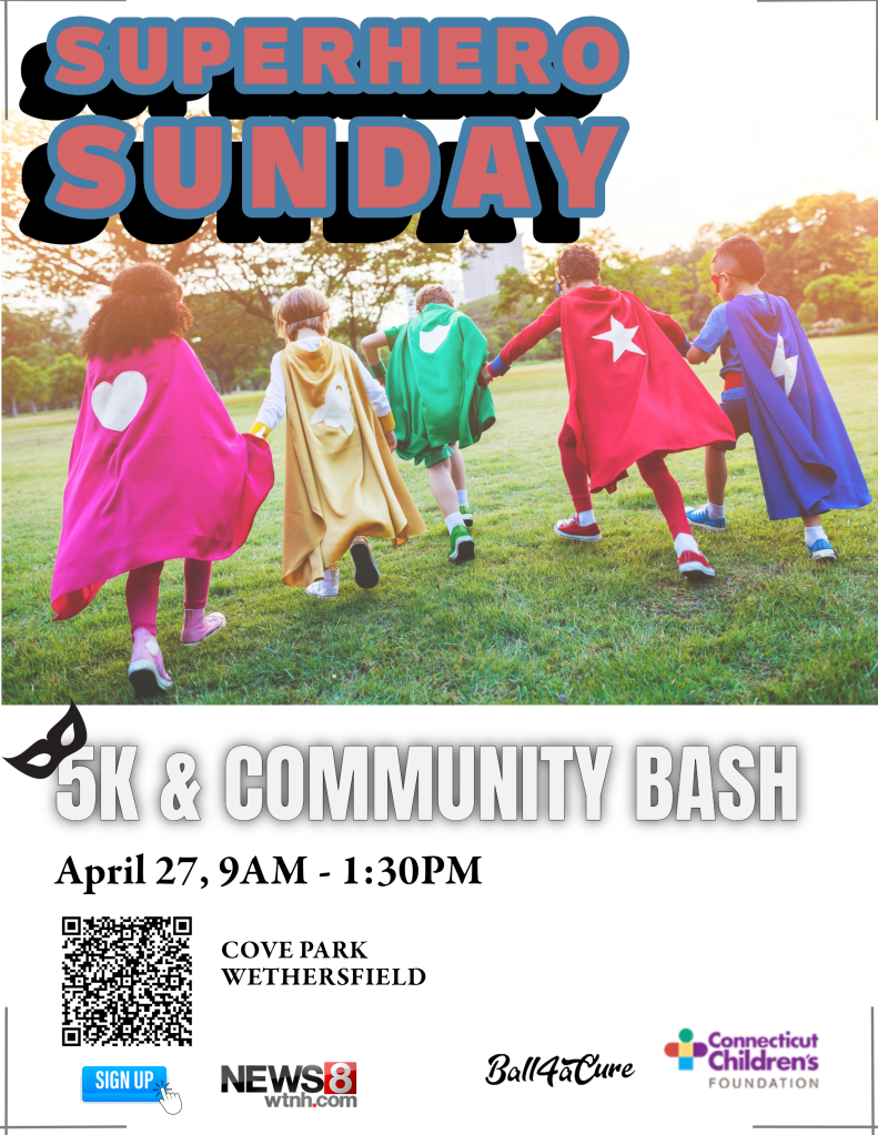
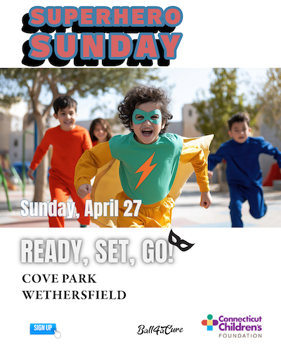
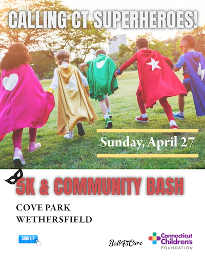
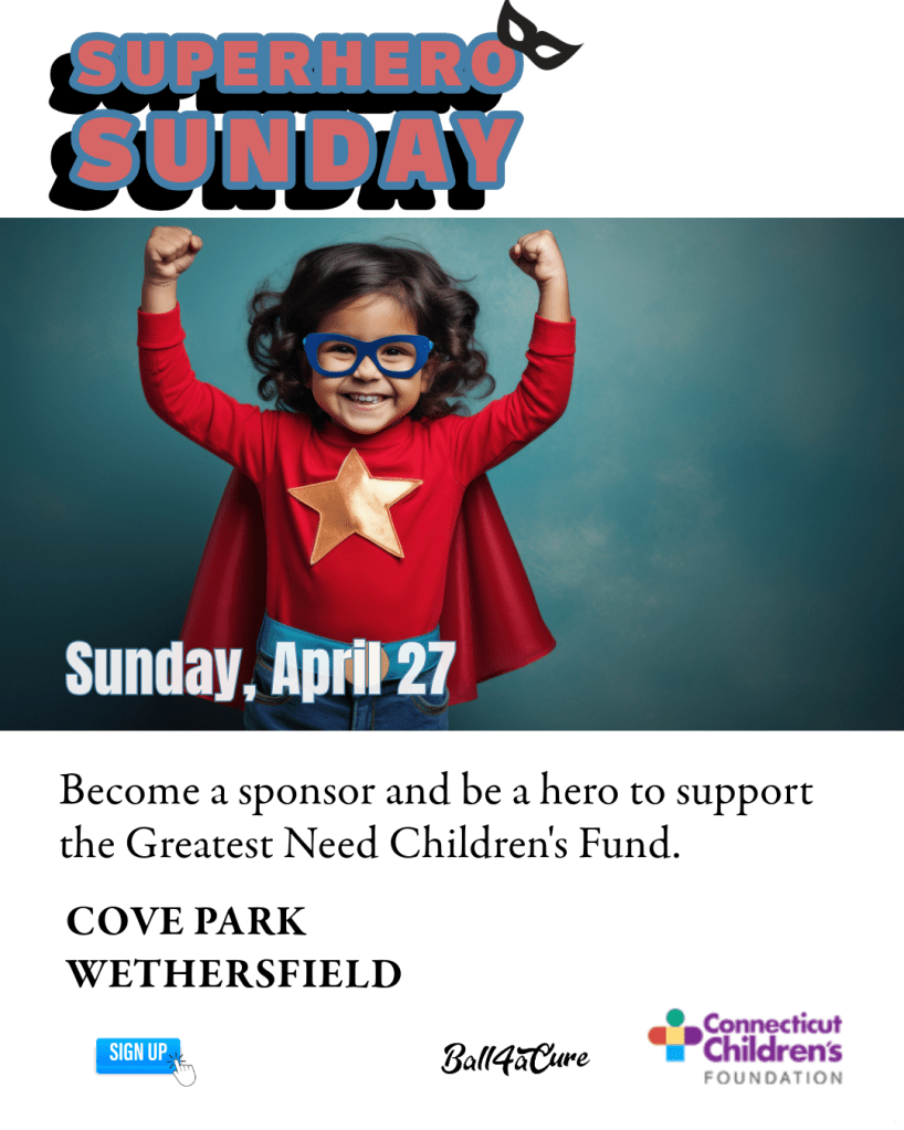
With the assignment from Quinnipiac to design layouts for an event using different channels, I selected an organization that has a relatively big event coming up at the end of April: Connecticut Children’s Superhero Sunday.
Prioritizing the Text
The name of the event is Superhero Sunday, which is catchy and short, so I wanted to include this in as many pieces as possible.
Since designs always look better when they are uncluttered, I attempted to keep the information to the essentials. For instance, while including that the event is stroller and wheelchair accessible, I decided that could be found in a central location.
Connecticut Children’s has a good amount of information on its website, so I decided to incorporate a QR code to its event page within the print pieces. In designing the Instagram posts, I suggest referring to a link in the CT Children’s bio for more information.
In terms of layout, I chose a left-aligned layout for readability and paired the event information with a fun superhero stock image. The text size, weight and style was determined based on the following hierarchy:
- Superhero Sunday
- 5K Run & Community Bash
- Date and time
- Details
- Connecticut Children’s and sponsor logos anchor the layout at the bottom.
Promotional Flyer: Simplifying the Essentials Keeping in mind the deadly sins of layout summarized in White Space Is Not Your Enemy: A beginners guide to communicating visually through graphic, web and multimedia design by Rebecca Hagen and Kim Golumbisky, I avoided trapping white space in the middle of the layouts.
A Word About Typeface
Looking at the Connecticut Children’s website I selected Garamond Premier Pro for the body copy because it looks similar. For the headline and subhead, I was looking for something bolder and in line with the event’s comic-book theme. I selected:
- Ballinger bubble font for the Superhero headline
- Anton font for the subhead
Instagram Posts
Since Instagram is so visual with 4” x 5” portrait posts, I removed the QR code and incorporated different images for the following posts.
Join CT Children’s in raising $100k to benefit the more than 144,642 kids who are cared for each year. (Link) in our bio for more info: https://give.connecticutchildrens.org
#CTChildrens #SuperheroSunday
This last one is directed to prospective community sponsors and should be targeted through Instagram as such:
Sponsors are needed for our 3rd Annual Superhero Sunday. A 5k run, walk and community bash. Join CT Children’s in raising $100k to benefit the more than 144,642 kids who are cared for each year. Four levels of sponsorship from $1,500 up to $15,000. #CTChildrens #SuperheroSunday
Contact Ericka Glebocki at eglebocki@connecticutchildrens.org.
(Link) in our bio for more info: https://give.connecticutchildrens.org
With carefully prioritized information within a similar look and feel across all the event materials including a print invitation, YouTube thumbnail etc, these are designed to help organizations like Connecticut Children’s draw in the crowds and say what needs to be said in a friendly, Connecticut Children’s way.
-
Designing with White Space

Regardless of the selected medium, white space gives any form of communication air to breathe. In a design setting, it is referred as negative space in contrast to the areas of a design where the headline and imagery appears.
Just like a powerful pause in speech, the space between elements on a page or screen gives the brain’s eye guidance on what should be seen first and how to follow the text. And the spaces are not necessarily white because we know a well thought out background color can evoke something specific to a brand.
In White Space in Design: Important Guidelines Every Designer Should Know by Jenn Pereira, white space equals usability. Simply put, people understand, enjoy, and learn more when information is intentionally arranged.
One natural grouping may be the way many websites frequently arrange their business card information at the bottom of their page. This includes the logo, office address, phone number and a site map.
Good design theory says the white spaces belong on the outside of the objects and not trapped in the middle. As one anonymous writer puts it:
“Good layout feng shui requires calming pools of negative space that help guide the viewer’s eye through the flow of the design.”
Popular theories like the following by a Rock content writer on how readers skim online content refer to F-shaped and Z-shaped reading patterns. Landing pages on websites where readers make a few vertical scrolls from top to bottom may benefit from arranging their information in accordance with the above two shapes.
Or as we see all the time in art galleries and type specimen posters, they may intentionally choose to disrupt the pattern.
Classic Trifold Brochure
Even with the proliferation of digital channels, organizations who serve a range of audiences in communities across Connecticut often handout pamphlets as a means of sharing program highlights.
Often, these are flyers on community bulletin boards or folded pieces of 8 ½ x 11” letter paper, jam packed with 9 or 10-point fonts.
It does not have to be so.
Hartford Promise is a nonprofit that helps high school students achieve college placement and bring their knowledge and skills back to the Connecticut workforce post-graduation.
The information trifold I designed for parents and guardians using information on their website shares essential information, within a design that incorporates wide margins and an information hierarchy.
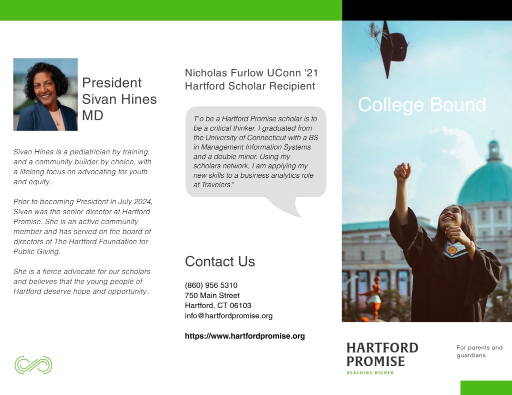
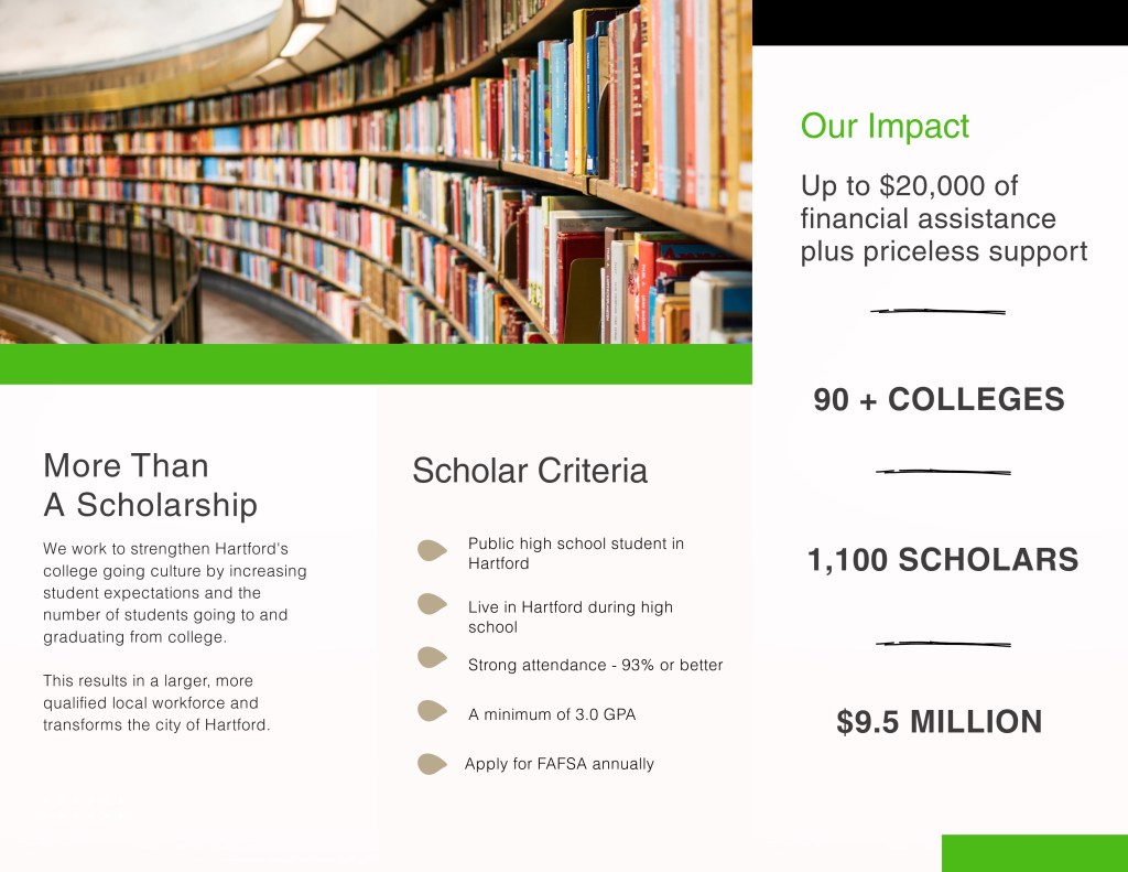
Learning to see more clearly means paying attention to visual arrangements in a way that is more discerning. white space is part of the design process. When used together, the online or print reader stays longer, learns more and has a better overall experience.
It is work that requires an attention to detail coupled with zooming out every now and then to make sure the big picture is captured.
-
Building a Communication Firm’s Brand Identity
My interest in nonprofits led me to paying attention to the wide range of materials and mediums used to reach people who engage with causes. Having a unified brand goes a long way in helping nonprofits achieve their goals, which usually fall into a few clear categories:
- Raise awareness of programs/services
- Keep staff informed and feeling appreciated
- Hire, educate and engage board members
- Raise funds with individuals and organizations
An idea I have is to establish a communications firm that focuses entirely on helping nonprofits achieve the above.
Developing a logo and identity system for the above involved thinking through what nonprofits needs are in terms of communications guidance and implementation. In my experience to date it comes down to building infrastructure, capacity and an ability to help nonprofits connect to their communities through a myriad of avenues.
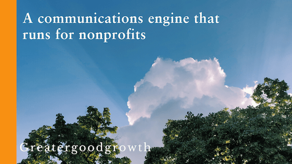
The firm’s name is Greater Good Growth.
The working tagline is “A communications engine that runs for nonprofits.”
Nonprofit people wear a lot of hats, which is why I chose to say “engine that runs” because from first-hand experience the people are seemingly running or walking swiftly through their days.
“To really make your logo sing, the ideals that make your business unique need to be understood by the designer and moulded into a visual signature that perfectly represents your brand.”
Insights by Creative Revolution (March 2017)Designing a Logo
After some brainstorming using Microsoft’s Copilot a few symbols surfaced that represent forming connections between people, communities and nonprofits.
Since most people in nonprofits go through their days like multitasking whirling dervishes, the initial visual ideas including bridges, arches and handshakes seemed too static.
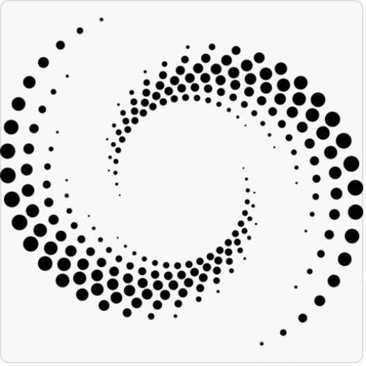
As I went back to the drawing board, I started thinking about shapes that spiral out giving off a higher frequency.
While the connection to nature may tie to certain environmental causes, it may confuse for this brand. So I began looking for more esoteric shapes that fit with the chosen colors.
I landed on a mosaic circular shape that you see below:


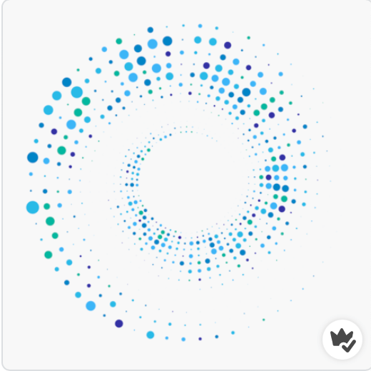
Designing a Logo
Other aspects of this emerging brand include the decision to use a Sabon typeface for its elegance and clarity, combined with Adobe handwritten for growth.
I selected blue as the primary color for its ability to capture the imagination and exude trust. In my recent blog , the Cultural Meaning of Color, blue is the color of far horizons, distant skies and oceans that help us to think more expansively. Paired with a vibrant orange for a dash of enthusiasm and zest, I have my color palette:
The tagline represented in the photo header is a promise to nonprofits. My portfolio shows a representation of work a prospect can expect in hiring an independent consultant as an extension of their lean nonprofit team.
-
The Meaning of Color
In a world that transmits messages in the scroll of a social media newsfeed, color can fast track meaning and act as an effective mnemonic device for brands looking to stand out among the crowd.
Beyond the essential color theory, spending time to examine how color is incorporated into art and branding is time well spent. Today, I am discussing three colors: blue, red and black.
Can’t Catch Blue
In the Wizard of Oz’s Somewhere Over the Rainbow, Judy Garland sings of blue skies that are as elusive as the color itself. Blue is the color of ocean and horizons; it is for dreamers and contemplators as it draws us from here to some place in our imaginations.
In the natural world, blue is an optical illusion and one that holds our attention. The sky only looks blue because it reflects the sea. If you put the salty waters in a jar, it would look a murky brown.
In The World According to Color: a Cultural History by James Fox, linguist Lazarus Geiger died at forty-one as he strove to digest as many world languages as possible. His work was the basis for later academic research that found a wide scale ‘blue color blindness’ that was less about eyesight and more about language development.
According to Brent Berling and Paul Kay’s Basic Color Terms, blue was one of the last colors to be defined because it wasn’t as prevalent as the greens and browns you find in nature. Some linguists do not distinguish between blue and green, so instead use the term “grue”. According to James Fox there are still many languages, including two Australian Aboriginal languages, that are still completely devoid of a term for blue.
After returning from a trip to Loch Lomond folk lore says that poet John Keats wrote of blue in certain flowers and as a ‘gentle cousin to forest green’.
Blue is also a popular flag color when paired with red. In the U.S., solid blue with white stars represents all 50 states. The thirteen red stripes represent the original British colonies that declared independence from the United Kingdom.
In contrast to the literary world, businesses often use blue to signal competence. Brands including Visa, Intel and VW all take advantage of its trustful hue. Most use very simple typography with the occasional symbol.
The Intel logo at one time included a swirl around its logo to signal movement and innovation. As its business model expanded, the master logo adjusted and simplified to an all-type format.
Seeing Red
Red is a ritualistic color used to symbolize power, passion and death. In Deep Color by Keith Recker red is used to describe bravery, bloodshed and power. It is often associated with ancient sacrifice to the gods, with the blood of animals used as a divine form of communication to please the gods. Red is commonly found in the attire of those presiding over high-ranking public ceremonies, both here in the U.S. and elsewhere.
Besides blood offerings and ceremonial garb, red symbolizes heart, anger and danger:
“A prevalent color in the dress uniforms of soldiers and guardsmen worldwide, red is an evocative choice, drawing depth from the relationship with blood, courage and danger.”
James Fox writes of its psychophysical impact including rapid eye blinking, increasing blood pressure and stronger electrical activity in the brain.
Brands that use red include the American Heart Association, the Boston Red Sox and Netflix.
A little bit of red goes a long way and works well with black.
The Black Widow
According to James Fox, black was one of the earliest colors to be named in physical realm. The color of ink in the quill, of mourning and in outer space, the unknowable black holes that hit the headlines every once in a blue moon. It has a literal and figurative ‘dark side’ that connect black to death, evil, and monsters under the bed.
For a color that was one of the earliest to be defined, you must wonder why isn’t it represented in the color wheel? It is kept separate, off to the side and only applied to a rainbow of hues, when and if needed. It adds shade to a lighter mix of colors and progressions of black to white when applied in monochromatic form.
Black is the opposite of light, which in art becomes the perfect duo.
In 18th Century Realism paintings before the first consumer-friendly Kodak camera was sold in September 1888, there was a lot of shade applied to paintings. That is why Claude Monet and the early 20th Century Impressionists were such a breath of fresh air and light.
Black can be a capricious push-pull color, two ends of a magnet that draw and repel. Many brands take advantage of its drama.
Beginning with WordPress, the blogging site used for the Masters in Interactive Media & Communications. In combination with the simple ‘W’ knockout logo, black gives the site authority.

Paying attention to color and exploring its meaning and uses can only make us better communicators.
-
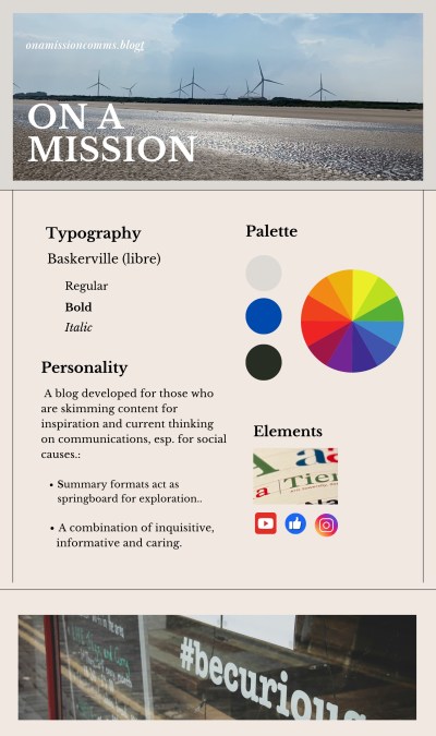
Styling ‘On a Mission’ Blog
Defining the visual aspects of a brand require tuning into what it’s all about. On a Mission communications is a blog for other communicators looking for inspiration and nonprofit leaders who want to connect their organization’s purpose with those who matter.
Working within the visual confines of a WordPress premium subscription, I tried my two shortlisted designs. The initial winner was Casthub, a stylish portfolio-style site by Automatic that would accommodate the content I have to share. As new themes are developed, I will adapt.
Looking at many different fonts, I narrowed it down to a few. They were all easy to read online and carried the kind of energy and enthusiasm you might expect from a blog like On A Mission communications.
- Literata: a transitional and modern typeface.
- Sabon: a round appearance and easy on the eye.
- Baskerville Libre: a tried-and-true font, dating back to the 19th Century.
As a bonus, Baskerville is also an open-source font, so I will not ever have to worry about paying license fees for its use.
Within the scope of the available WordPress color palettes, I chose a neutral theme. I then took it a step further in the initial Brand Guide with a light gray offset with a pop of royal blue. This will add more energy than currently available in the pre-packaged palette.
Rationale for a neutral approach is to let the content come through versus competing with the packaging.
Visual Guidelines
To fully express all that On a Mission is designed for, I will be leveling up my WordPress skillset.
-
Experimenting With Type
As my head is swimming in artfully arranged type, I am waking up to a new way of seeing signs that I had barely noticed before now.
People spend their entire careers designing the minute aspects of all kinds of type. This translates to an overwhelming selection of typefaces to choose between. Some guidelines for choosing typefaces are offered by Ellen Lupton in her book thinking with TYPE:
- Consider the overall context for the message and where it will be placed. Will the words be savored, skimmed or scrolled by and who will be reading them?
- What is the overall attitude to be conveyed ranging from humor, education, a serious message or something more pensive.
- Test different fonts for a specific project or situation to see what works.
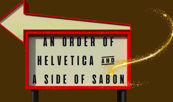
Taking the fictitious character Guy Noir by Garrison Keillor, let’s imagine for a moment three ways a scene plays out, right in front of New York City’s famous Stardust Diner at 1650 Broadway.
As Guy Noir moves out of the shadows into the crowded city street, the heavens open and down pours …
(scene one) Pours the most camp arrangement of geometric sans: nobel, sofia, objecktiv, century gothic and of course, metro. Not to worry. He turns his collar up as he notices the 24 -hour Stardust Diner sign and he RECKONS he is in for a Helvetica of a meal.
Caption: Helvetica TYPE plus a Bold Alex’s brush cursive, adding extra kerning space (20) and 1.4 between lines. The overall effect is clean, legible and understated.
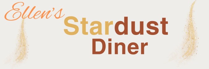
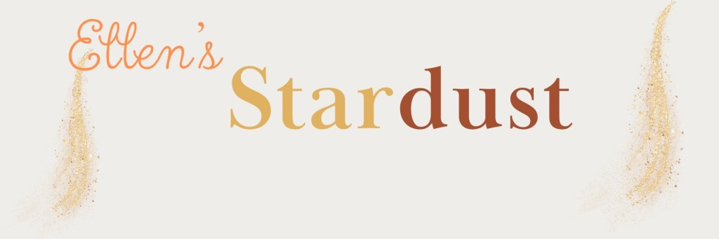
(scene two) Falls the most heavenly clean drinking water he had ever tasted. Each drop shaped like the dot of an ‘I” in twelve different varieties. Noir took ten luxurious minutes to sample each one and he decided upon the Odile dot, a slippery and sly font by Gills Sans Light.

Caption: Gill Sans light with block lettering for extra prominence plus a condensed cursive font for the owner’s name called Rumba.
(scene three) Bursts the most obnoxious horn. There in middle of fifth avenue stood a double freight, big wheels with a roomy cabin where one salty driver and his bold-faced friend belted out Adelle by Jose Scaglione, Bernoka Burian as they read from a Baskerville script.
Caption: Baskerville Display PT Bold plus a cursive font with more kerning. The diner’s namesake is in a True north cursive.
A big challenge with each of the above scenes was finding a fitting font plus something complementary for the diner’s namesake that didn’t overpower the rest of the sign. Many fonts were too elongated, so it was trial and error to find something that fit.
Settling on a font choice is only part of the equation. Then comes the artform of layout and hierarchy.
Beyond Fonts
In the book, thinking with type by Ellen Lupton (2024), the author introduces guidelines with the merits of using a hierarchical or a layered hierarchy in design. The latter requires more graphic design than I am qualified to explain, so I opted for a hierarchical approach.
By intentionally keeping the color format neutral, I kept the focus on font.
- Start simple. Decide upon one size and font style and use it to separate parts of text.
- Add space to experiment with the aesthetic and understandability.
- Try an additional weight to accentuate legibility.
- Dial up scale for visual interest and hierarchy
- Elect whether using color in text will add or detract from the message.
Of the three signs I created, the Gill Sans Light font works well in my mind. It has more personality than the other two, a reflection of the good times ahead when customers walk through the door for a regular breakfast with a fantastic side of Broadway tunes.
-
Hartford Promise: Design for Equity in Education
This week I stepped into a formal Visual Design class for the first time. Design so far, has been a combination of instincts, osmosis learning from graphic designers, and a clear sense of the communication strategy.
According to WebMD, emotion transmits much more quickly than rational thought thanks to the quick response rate of the limbic part of the brain.
Visual design plays a supporting role in enabling understanding and making the right emotional connections. The components of a visual brand comprise of all the graphics, images and colors that transmit the brand in question.
Now let us look at the components of Hartford Promise’s digital assets including its website and social media channels. Hartford Promise is a 501(c)3 nonprofit that provides Hartford Public High School students funding and support to get them into college and through to graduation.
At its core, this is an organization that stands for opportunity and equity by putting college in reach for students who are economically oppressed. If we look at the organization’s digital assets including its website and social media channels, we get a sense for its message and visual presence.
Hartford Promise: current logo
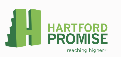
Hartford Promise’s logo looks similar to Minecraft gaming with its pixelated blocks behind the letter H. The logo looks to be applied consistently, with the exception of its Tik Tok account.
The tagline “Reaching Higher” aptly captures the essence of opportunity and expectations for student success. The tagline isn’t universally applied and it is very challenging to see in many social media channels, due to the exceptionally tiny font.
The color palette including the logo is very very green, which gives it an environmental flair. While this may work for some youth, it may not resonate as closely with all the businesses and individual donors that support Hartford Promise.
Hartford Promise is now in its tenth year, which seems like an excellent time to evaluate its brand against organizational growth plans. In the coming weeks I will take a closer look at individual elements of its visual design and share ideas to sharpen its visual persona in line with what I understand it wants to portray.
-
Elements of Effective Blog Design
On a Mission blog is for communicators, learners and nonprofit decision makers who want to educate and influence their priority audiences.
With six Interactive Media & Communications classes under my belt, I have already created well over thirty blog posts covering content creation, interactive writing and social media.
This is the perfect time to curate and reconsider the optimal blog format and design to show the work.
Blog Reviews
I reviewed a number of marketing industry blogs because they have all the best practices in place. I also looked at other Quinnipiac University student blogs because I know the younger generations have their online *hit pulled together.
Name/URL First noticed What works What else? Samantha Sheehy She identifies her three areas as “Public Relations, Music & Media”. Casual and clear introduction.
Consistent voice to “hang out” on social media.Samantha’s name covers up the content when scrolling. It is distracting. Kim Shepherd Kim’s personality.
QU samples.Beautifully designed. Kim could share her methods. Seth’s Blog He doesn’t have to introduce himself. Simplicity.
Words that make you think.Three paragraph blogs at the most. Ted Talk Blog Clear design hierarchy allows top story to pop Balanced design is easy on the eye. CTA’s To follow = interest. Subscribe = to engage. Standout blogs regardless of whether they are students or industry-leaders, all share a few things:
- Distinct voice that communicates who they are.
- Clear blog structure and navigation.
- Design that adds gravitas to their words.
Working with WordPress, I currently have a design called Tenku in place. While it shows the top story, it is geared for magazines, which gives it a “busy” versus ‘less is more’ look. Here is what I am looking for in a blog design:
Looking through dozens of options with the above in mind, I’ve narrowed it down to two possible designs that fit the content.
Now the real work begins as I migrate the content developed to date over to the final design.
-
AI: Friend or Foe?
In my LinkedIn articles and blog posts, I have discussed some of AI’s powerful capabilities and covered some of the ways nonprofits can carefully evaluate and introduce its benefits to improve fundraising, strengthen relationships and alleviate administrative tasks.
Out of the 30-plus resources I reviewed and summarized, one of the most powerful was a podcast on generative AI with three technology leaders that describes AI as the ability to absorb vast amounts of information, generate new kinds of information, and take actions on that information. My favorite description of AI came from a podcast conversation between three technology pioneers at the 2024 World Economic Forum that likened AI’s capabilities to “a wizard that knows how to write new spells by studying existing ones.”
The Pros
One of the most powerful ways AI can help nonprofits is by understanding donor behavior to a level of granularity that allows for finite segmentation and personalization, which is invaluable to anyone in a development or marketing function. The catch? AI needs TONS of healthy and accurate data to work properly. The specifics are covered in my second LinkedIn article on using AI to manage donors.
The second approach that AI can be helpful to nonprofits is its use of large language models (LLMs) to create content. With a bit of AI prompting experience, content drafts can be generated by AI in half the time that can be reviewed and adapted for specific needs.
There are also numerous administrative tasks including writing meeting recaps, developing agendas, finding electronic files that are expedited by using AI, freeing resource-constrained nonprofits to work on relationship building.
In the book, The Networked Nonprofit: Connecting with Social Media to Drive Change, authors Beth Kanter and Allison Fine give examples of nonprofits like the Brooklyn Museum and the Smithsonian using technology to engage the wider community. While this was written before AI became mainstream, it gives examples of community-curated photography exhibits and ways of working with the outside world that can be adapted to how AI is introduced.
The Cons
The potential for bias is present if AI is built and trained on historical data that incorporates injustices. Dr. Brene Brown calls this “scaling injustice” in her Unlocking Us podcast conversation with Dr. S. Craig Watkins, where the solution comes down to practices that include computer engineers talking to a wide spectrum of subject matter experts, so programs are intentionally built to be inclusive. Any nonprofit leader or small business owner should understand what is under the hood of any AI model before it is implemented.
This conversation also touches upon a big human fear: being irrelevant. New technology raises all kinds of questions about who owns the content and generative AI feels like displacement for anyone in a field that puts words on paper to make a living.
Yet the technology is here, and it is inexpensive, so it is an opportune time to figure out how to incorporate it, while keeping a “human in-the-loop” and building on our qualities and skills. I talk about how nonprofits can evaluate and incorporate AI while upholding their commitment to protecting their stakeholders and serving others in this week’s LinkedIn article titled, “A Human-Centered AI Policy for Nonprofits.”
Friend or Foe?
It is predicted that humans will adapt by moving towards “augmented intelligence”, which is a much more palatable future for anyone looking to hold onto what makes us human.
On the bright side, we can imagine walking around with a super powerful reasoning brain on an App like Copilot or ChatGPT. (GPT stands for Generative Pre-trained Transformer.)
On the dark side, I hope technology is programmed with traps and red alerts for anyone who is planning on using its powers for divisive reasons that create more hurt than good.
If used with all the best of intentions and documented “guardrails”, I’d say AI for nonprofits is a friend that is here to stay.
-
AI’s Potential for Nonprofits (Part 4)

As I explore the creative and analytical possibilities of AI for nonprofit marketing, another skillset is emerging: prompt engineering.
This phrase is a little misleading as it has nothing to do with coding algorithms. Instead, it refers to the way humans speak to “reasoning” machines using text prompts to get the most out of them.
This week I used Microsoft’s AI Copilot to draft an appeal letter for Connecticut Children’s, using a press release published on the hospital’s website about the construction of a new 8-story pediatric tower that is underway. Then I used Google’s version of AI it calls Gemini to draft web copy for volunteers using a brief testimonial-style approach.
The text results were pleasing and without a doubt, time saving. It is too soon to say which tool has the most creative power, so I’m going to use both of them for now.
The Art of Prompting
The process for giving AI applications good input is a bit like writing a creative brief. If the briefs (“prompts”) are specific and on point, you can get a good jump start on a creative initiative because large language models (LLMs) are already so sophisticated.
Guidance in the Career Essentials in Generative AI short course by Microsoft and LinkedIn is that writing strong prompts comes down to: including specifics about what information to include, breaking down the complex into short sentences, and even including desired tone or aesthetic, if looking for a visual.
Prompts that ask the algorithm to role play, provide pros and cons of a situation, or develop creative ideas can be enlightening.
To improve results, I learned to iterate on prompts, struggling a bit when using Microsoft’s Designer tool to generate imagery that would potentially work in a nonprofit situation.
To give you a better idea, here are two initial prompts for imagery needed for a blood drive campaign, and what they yielded:
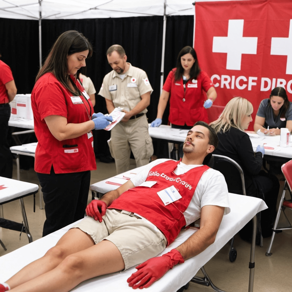
- Create a true to life photograph showing an American Red Cross blood drive with a volunteer sitting at a table signing people into the event. In the background there are people lying down on tables giving blood and you can see the blood bags hanging up.
- It is Halloween and the American Red Cross is having a blood drive with a volunteer wearing a vamping costume sitting at a table signing people into the event. In the background there are people lying down on tables with IV blood bags. Everyone is wearing Halloween costumes. On the table there is a sign that is crayoned in black, saying “We want your blood.”
I also tried Open AI’s Art application, testing the first prompt above and then trying its editor, which updated my prompt (below) to yield results that were more photorealistic, but not true-to-life:
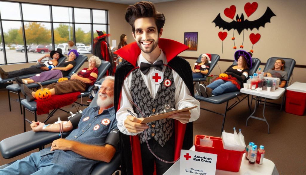

- (accurately spelled text “American Red Cross”), photorealistic, warm color scheme, vibrant reds and soothing tans, heartfelt atmosphere, people lying on tables donating blood, diverse individuals engaged in the process, blood bags hanging in view, a prominent white sign featuring the Red Cross emblem, “American Red Cross” in clear black type, well-composed background showcasing an inviting blood drive environment, ultra-detailed, inspirational mood.
opejnart.ai ARC blood drive 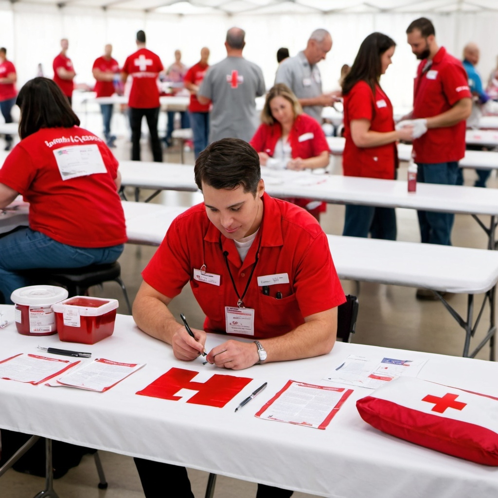
opejnart.ai ARC blood drive After digging into the practical application of AI for creative endeavors, I am seeing tons of potential with the text generative AI and have a long way to go with the development of images. The information isn’t always accurate and it can take trial and error, but I’m really amazed with what can be produced, in very little time.
For nonprofits or really anyone looking to create efficiencies, I can see why technologists are calling AI the next industrial revolution.
There is an abundance of resources about effective prompting, and most of the AI tools have a free version for anyone who is just getting started. I will leave you with a few of the resources I discovered this week and there is no time like now to see where this takes you:

Leave a comment