As my head is swimming in artfully arranged type, I am waking up to a new way of seeing signs that I had barely noticed before now.
People spend their entire careers designing the minute aspects of all kinds of type. This translates to an overwhelming selection of typefaces to choose between. Some guidelines for choosing typefaces are offered by Ellen Lupton in her book thinking with TYPE:
- Consider the overall context for the message and where it will be placed. Will the words be savored, skimmed or scrolled by and who will be reading them?
- What is the overall attitude to be conveyed ranging from humor, education, a serious message or something more pensive.
- Test different fonts for a specific project or situation to see what works.
Taking the fictitious character Guy Noir by Garrison Keillor, let’s imagine for a moment three ways a scene plays out, right in front of New York City’s famous Stardust Diner at 1650 Broadway.
As Guy Noir moves out of the shadows into the crowded city street, the heavens open and down pours …
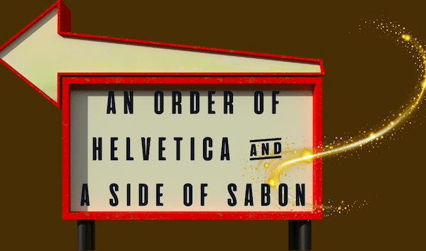
(scene one) Pours the most camp arrangement of geometric sans: nobel, sofia, objecktiv, century gothic and of course, metro. Not to worry. He turns his collar up as he notices the 24 -hour Stardust Diner sign and he RECKONS he is in for a Helvetica of a meal.

Caption: Helvetica TYPE plus a Bold Alex’s brush cursive, adding extra kerning space (20) and 1.4 between lines. The overall effect is clean, legible and understated.
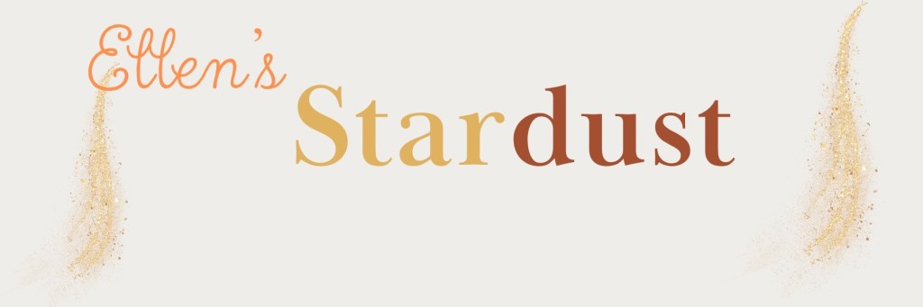
(scene two) Falls the most heavenly clean drinking water he had ever tasted. Each drop shaped like the dot of an ‘I” in twelve different varieties. Noir took ten luxurious minutes to sample each one and he decided upon the Odile dot, a slippery and sly font by Gills Sans Light.

Caption: Gill Sans light with block lettering for extra prominence plus a condensed cursive font for the owner’s name called Rumba.
(scene three) Bursts the most obnoxious horn. There in middle of fifth avenue stood a double freight, big wheels with a roomy cabin where one salty driver and his bold-faced friend belted out Adelle by Jose Scaglione, Bernoka Burian as they read from a Baskerville script.
Caption: Baskerville Display PT Bold plus a cursive font with more kerning. The diner’s namesake is in a True north cursive.
A big challenge with each of the above scenes was finding a fitting font plus something complementary for the diner’s namesake that didn’t overpower the rest of the sign. Many fonts were too elongated, so it was trial and error to find something that fit.
Settling on a font choice is only part of the equation. Then comes the artform of layout and hierarchy.
Beyond Fonts
In the book, thinking with type by Ellen Lupton (2024), the author introduces guidelines with the merits of using a hierarchical or a layered hierarchy in design. The latter requires more graphic design than I am qualified to explain, so I opted for a hierarchical approach.
By intentionally keeping the color format neutral, I kept the focus on font.
- Start simple. Decide upon one size and font style and use it to separate parts of text.
- Add space to experiment with the aesthetic and understandability.
- Try an additional weight to accentuate legibility.
- Dial up scale for visual interest and hierarchy
- Elect whether using color in text will add or detract from the message.
Of the three signs I created, the Gill Sans Light font works well in my mind. It has more personality than the other two, a reflection of the good times ahead when customers walk through the door for a regular breakfast with a fantastic side of Broadway tunes.

Responses to blog