
Defining the visual aspects of a brand require tuning into what it’s all about. On a Mission communications is a blog for other communicators looking for inspiration and nonprofit leaders who want to connect their organization’s purpose with those who matter.
Working within the visual confines of a WordPress premium subscription, I tried my two shortlisted designs. The initial winner was Casthub, a stylish portfolio-style site by Automatic that would accommodate the content I have to share. As new themes are developed, I will adapt.
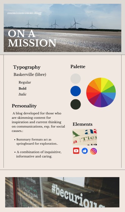
Looking at many different fonts, I narrowed it down to a few. They were all easy to read online and carried the kind of energy and enthusiasm you might expect from a blog like On A Mission communications.
- Literata: a transitional and modern typeface.
- Sabon: a round appearance and easy on the eye.
- Baskerville Libre: a tried-and-true font, dating back to the 19th Century.
As a bonus, Baskerville is also an open-source font, so I will not ever have to worry about paying license fees for its use.
Within the scope of the available WordPress color palettes, I chose a neutral theme. I then took it a step further in the initial Brand Guide with a light gray offset with a pop of royal blue. This will add more energy than currently available in the pre-packaged palette.
Rationale for a neutral approach is to let the content come through versus competing with the packaging.
Visual Guidelines
To fully express all that On a Mission is designed for, I will be leveling up my WordPress skillset.

Responses to blog