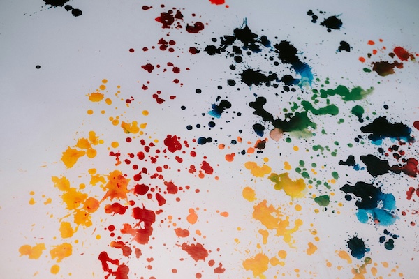
In a world that transmits messages in the scroll of a social media newsfeed, color can fast track meaning and act as an effective mnemonic device for brands looking to stand out among the crowd.
Beyond the essential color theory, spending time to examine how color is incorporated into art and branding is time well spent. Today, I am discussing three colors: blue, red and black.
Can’t Catch Blue
In the Wizard of Oz’s Somewhere Over the Rainbow, Judy Garland sings of blue skies that are as elusive as the color itself. Blue is the color of ocean and horizons; it is for dreamers and contemplators as it draws us from here to some place in our imaginations.
In the natural world, blue is an optical illusion and one that holds our attention. The sky only looks blue because it reflects the sea. If you put the salty waters in a jar, it would look a murky brown.
In The World According to Color: a Cultural History by James Fox, linguist Lazarus Geiger died at forty-one as he strove to digest as many world languages as possible. His work was the basis for later academic research that found a wide scale ‘blue color blindness’ that was less about eyesight and more about language development.
According to Brent Berling and Paul Kay’s Basic Color Terms, blue was one of the last colors to be defined because it wasn’t as prevalent as the greens and browns you find in nature. Some linguists do not distinguish between blue and green, so instead use the term “grue”. According to James Fox there are still many languages, including two Australian Aboriginal languages, that are still completely devoid of a term for blue.
After returning from a trip to Loch Lomond folk lore says that poet John Keats wrote of blue in certain flowers and as a ‘gentle cousin to forest green’.
Blue is also a popular flag color when paired with red. In the U.S., solid blue with white stars represents all 50 states. The thirteen red stripes represent the original British colonies that declared independence from the United Kingdom.
In contrast to the literary world, businesses often use blue to signal competence. Brands including Visa, Intel and VW all take advantage of its trustful hue. Most use very simple typography with the occasional symbol.
The Intel logo at one time included a swirl around its logo to signal movement and innovation. As its business model expanded, the master logo adjusted and simplified to an all-type format.
Seeing Red
Red is a ritualistic color used to symbolize power, passion and death. In Deep Color by Keith Recker red is used to describe bravery, bloodshed and power. It is often associated with ancient sacrifice to the gods, with the blood of animals used as a divine form of communication to please the gods. Red is commonly found in the attire of those presiding over high-ranking public ceremonies, both here in the U.S. and elsewhere.
Besides blood offerings and ceremonial garb, red symbolizes heart, anger and danger:
“A prevalent color in the dress uniforms of soldiers and guardsmen worldwide, red is an evocative choice, drawing depth from the relationship with blood, courage and danger.”
James Fox writes of its psychophysical impact including rapid eye blinking, increasing blood pressure and stronger electrical activity in the brain.
Brands that use red include the American Heart Association, the Boston Red Sox and Netflix.
A little bit of red goes a long way and works well with black.
The Black Widow
According to James Fox, black was one of the earliest colors to be named in physical realm. The color of ink in the quill, of mourning and in outer space, the unknowable black holes that hit the headlines every once in a blue moon. It has a literal and figurative ‘dark side’ that connect black to death, evil, and monsters under the bed.
For a color that was one of the earliest to be defined, you must wonder why isn’t it represented in the color wheel? It is kept separate, off to the side and only applied to a rainbow of hues, when and if needed. It adds shade to a lighter mix of colors and progressions of black to white when applied in monochromatic form.
Black is the opposite of light, which in art becomes the perfect duo.
In 18th Century Realism paintings before the first consumer-friendly Kodak camera was sold in September 1888, there was a lot of shade applied to paintings. That is why Claude Monet and the early 20th Century Impressionists were such a breath of fresh air and light.
Black can be a capricious push-pull color, two ends of a magnet that draw and repel. Many brands take advantage of its drama.
Beginning with WordPress, the blogging site used for the Masters in Interactive Media & Communications. In combination with the simple ‘W’ knockout logo, black gives the site authority.

Paying attention to color and exploring its meaning and uses can only make us better communicators.

Responses to blog