My interest in nonprofits led me to paying attention to the wide range of materials and mediums used to reach people who engage with causes. Having a unified brand goes a long way in helping nonprofits achieve their goals, which usually fall into a few clear categories:
Raise awareness of programs/services
Keep staff informed and feeling appreciated
Hire, educate and engage board members
Raise funds with individuals and organizations
An idea I have is to establish a communications firm that focuses entirely on helping nonprofits achieve the above.
Developing a logo and identity system for the above involved thinking through what nonprofits needs are in terms of communications guidance and implementation. In my experience to date it comes down to building infrastructure, capacity and an ability to help nonprofits connect to their communities through a myriad of avenues.
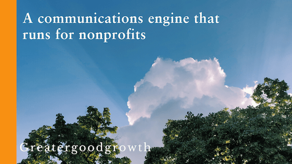
The firm’s name is Greater Good Growth.
The working tagline is “A communications engine that runs for nonprofits.”
Nonprofit people wear a lot of hats, which is why I chose to say “engine that runs” because from first-hand experience the people are seemingly running or walking swiftly through their days.
“To really make your logo sing, the ideals that make your business unique need to be understood by the designer and moulded into a visual signature that perfectly represents your brand.”
Insights by Creative Revolution (March 2017)
Designing a Logo
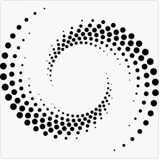
After some brainstorming using Microsoft’s Copilot a few symbols surfaced that represent forming connections between people, communities and nonprofits.
Since most people in nonprofits go through their days like multitasking whirling dervishes, the initial visual ideas including bridges, arches and handshakes seemed too static.
As I went back to the drawing board, I started thinking about shapes that spiral out giving off a higher frequency.
While the connection to nature may tie to certain environmental causes, it may confuse for this brand. So I began looking for more esoteric shapes that fit with the chosen colors.
I landed on a mosaic circular shape that you see below:
Designing a Logo
Other aspects of this emerging brand include the decision to use a Sabon typeface for its elegance and clarity, combined with Adobe handwritten for growth.
I selected blue as the primary color for its ability to capture the imagination and exude trust. In my recent blog , the Cultural Meaning of Color, blue is the color of far horizons, distant skies and oceans that help us to think more expansively. Paired with a vibrant orange for a dash of enthusiasm and zest, I have my color palette:
The tagline represented in the photo header is a promise to nonprofits. My portfolio shows a representation of work a prospect can expect in hiring an independent consultant as an extension of their lean nonprofit team.


Responses to blog