
Regardless of the selected medium, white space gives any form of communication air to breathe. In a design setting, it is referred as negative space in contrast to the areas of a design where the headline and imagery appears.
Just like a powerful pause in speech, the space between elements on a page or screen gives the brain’s eye guidance on what should be seen first and how to follow the text. And the spaces are not necessarily white because we know a well thought out background color can evoke something specific to a brand.
In White Space in Design: Important Guidelines Every Designer Should Know by Jenn Pereira, white space equals usability. Simply put, people understand, enjoy, and learn more when information is intentionally arranged.
One natural grouping may be the way many websites frequently arrange their business card information at the bottom of their page. This includes the logo, office address, phone number and a site map.
Good design theory says the white spaces belong on the outside of the objects and not trapped in the middle. As one anonymous writer puts it:
“Good layout feng shui requires calming pools of negative space that help guide the viewer’s eye through the flow of the design.”
Popular theories like the following by a Rock content writer on how readers skim online content refer to F-shaped and Z-shaped reading patterns. Landing pages on websites where readers make a few vertical scrolls from top to bottom may benefit from arranging their information in accordance with the above two shapes.
Or as we see all the time in art galleries and type specimen posters, they may intentionally choose to disrupt the pattern.
Classic Trifold Brochure
Even with the proliferation of digital channels, organizations who serve a range of audiences in communities across Connecticut often handout pamphlets as a means of sharing program highlights.
Often, these are flyers on community bulletin boards or folded pieces of 8 ½ x 11” letter paper, jam packed with 9 or 10-point fonts.
It does not have to be so.
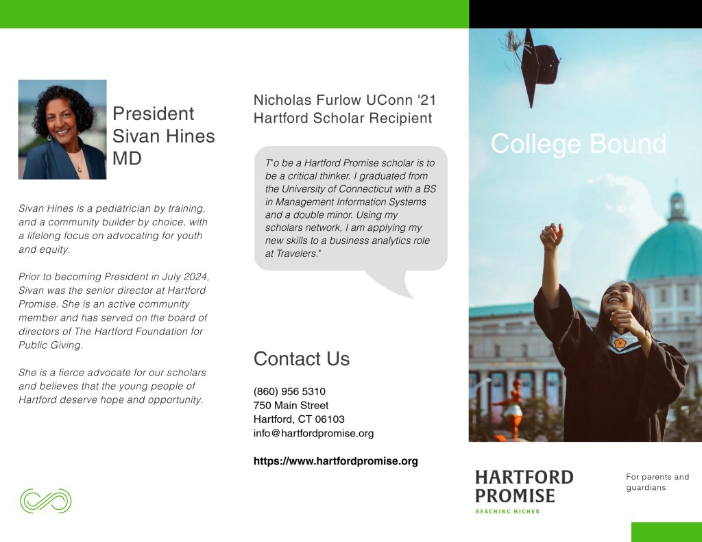
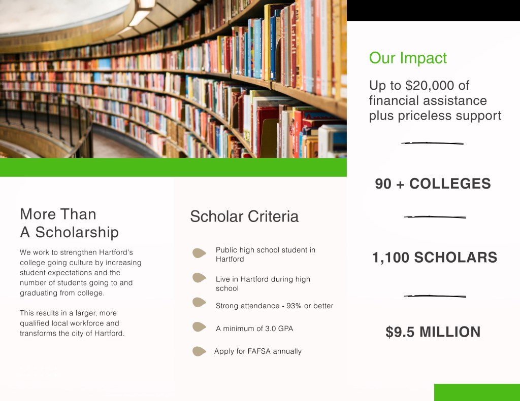
Hartford Promise is a nonprofit that helps high school students achieve college placement and bring their knowledge and skills back to the Connecticut workforce post-graduation.
The information trifold I designed for parents and guardians using information on their website shares essential information, within a design that incorporates wide margins and an information hierarchy.
Learning to see more clearly means paying attention to visual arrangements in a way that is more discerning. white space is part of the design process. When used together, the online or print reader stays longer, learns more and has a better overall experience.
It is work that requires an attention to detail coupled with zooming out every now and then to make sure the big picture is captured.

Responses to blog