Before a designer can begin to put their visual skills to work, a creative brief is an essential input. While typically I have worked in roles where I am developing the creative input, this week I wore a graphics designer hat.
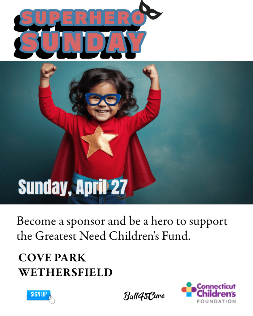
With the assignment from Quinnipiac to design layouts for an event using different channels, I selected an organization that has a relatively big event coming up at the end of April: Connecticut Children’s Superhero Sunday.
Prioritizing the Text
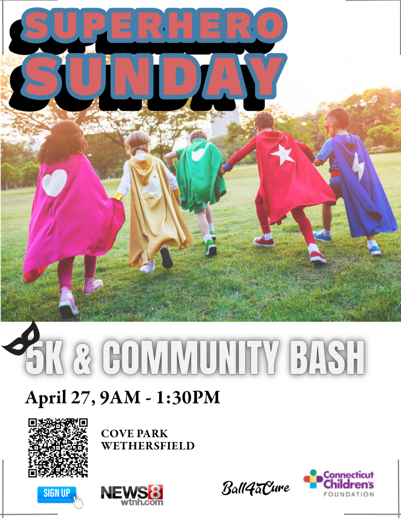
The name of the event is Superhero Sunday, which is catchy and short, so I wanted to include this in as many pieces as possible.
Since designs always look better when they are uncluttered, I attempted to keep the information to the essentials. For instance, while including that the event is stroller and wheelchair accessible, I decided that could be found in a central location.
Connecticut Children’s has a good amount of information on its website, so I decided to incorporate a QR code to its event page within the print pieces. In designing the Instagram posts, I suggest referring to a link in the CT Children’s bio for more information.
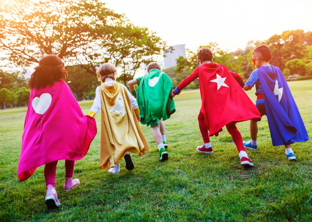
In terms of layout, I chose a left-aligned layout for readability and paired the event information with a fun superhero stock image. The text size, weight and style was determined based on the following hierarchy:
- Superhero Sunday
- 5K Run & Community Bash
- Date and time
- Details
- Connecticut Children’s and sponsor logos anchor the layout at the bottom.
Keeping in mind the deadly sins of layout summarized in White Space Is Not Your Enemy: A beginners guide to communicating visually through graphic, web and multimedia design by Rebecca Hagen and Kim Golumbisky, I avoided trapping white space in the middle of the layouts.
A Word About Typeface
Looking at the Connecticut Children’s website I selected Garamond Premier Pro for the body copy because it looks similar. For the headline and subhead, I was looking for something bolder and in line with the event’s comic-book theme. I selected:
- Ballinger bubble font for the Superhero headline
- Anton font for the subhead
Instagram Posts
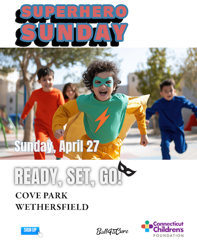
Since Instagram is so visual with 4” x 5” portrait posts, I removed the QR code and incorporated different images for the following posts.
Join CT Children’s in raising $100k to benefit the more than 144,642 kids who are cared for each year. (Link) in our bio for more info: https://give.connecticutchildrens.org
#CTChildrens #SuperheroSunday
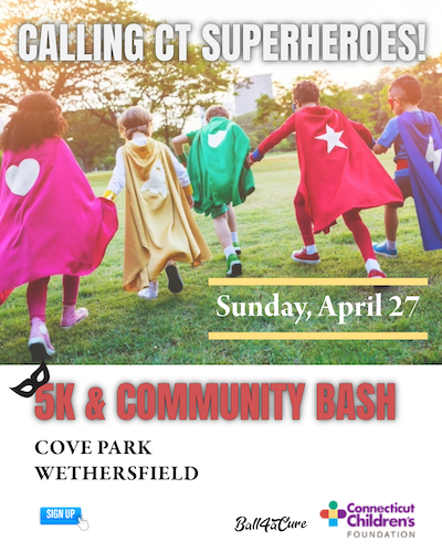
This last one is directed to prospective community sponsors and should be targeted through Instagram as such:
Sponsors are needed for our 3rd Annual Superhero Sunday. A 5k run, walk and community bash. Join CT Children’s in raising $100k to benefit the more than 144,642 kids who are cared for each year. Four levels of sponsorship from $1,500 up to $15,000. #CTChildrens #SuperheroSunday
Contact Ericka Glebocki at eglebocki@connecticutchildrens.org.
(Link) in our bio for more info: https://give.connecticutchildrens.org
With carefully prioritized information within a similar look and feel across all the event materials including a print invitation, YouTube thumbnail etc, these are designed to help organizations like Connecticut Children’s draw in the crowds and say what needs to be said in a friendly, Connecticut Children’s way.

Responses to blog