
Hartford Promise is a 501(c)3 that makes the dream of college a reality for hundreds of Hartford Public High School students who have what it takes to attend a four-year University.
Below you will find a brand review and recommendations for evolving its visual brand. For anyone in a development or communications role, this can be an insightful way to examine your brand.
The closest nonprofit of its kind that I found in the Hartford area is Hartford Youth Scholars, an organization that works with students beginning in middle school on long-term academic success, including college placement.
Brand Evolution
Hartford Promise has a youthful brand with a look and feel reminiscent of the Minecraft video game, popular with teenagers. Its tagline is hard to read in certain social media applications, most notably Instagram.
As the organization matures and continues to appeal to an increasing number of funders and donors, its visual brand needs to work for a more diverse demographic.
The following presentation shows how I suggest evolving Hartford Promise’s visual brand, including its logo, brand palette and typography.

Knowing that the long-term aim is for Hartford Promise Scholars to return to the area, there is also an opportunity to visually demonstrate the organization’s commitment to the City of Hartford.
Website Wireframe
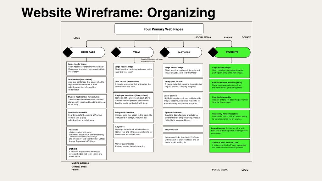
Outside of the visual brand, I reviewed the structure of Hartford Promise’s website and recommend organizing its content into four primary pages, with content categories listed on each page from top to bottom. This and the rationale is included in the above presentation.
Now in its tenth year, Hartford Promise is poised to strengthen its vibrant image and apply a consistent visual brand across multiple channels.

Responses to blog