
In a world fraught with short attention spans, less is always more in design. It calms the mind and provides a pleasing platform to gain a person’s attention.
This is the principle I applied to the development of email mastheads and stationery developed for the nonprofit Hartford Promise. It is an easy design assignment in that the information to be communicated is selective, including:
- Logo
- Name: Newsletter or Enews
- Image: Optional
- Date: Month, Year
With this in mind, I developed two design options for an eNews masthead. One centered and the other left aligned. I think the centered layout is more vibrant than the second and is a better choice. It also allows the organization to update the visual each month to reflect a key topic:
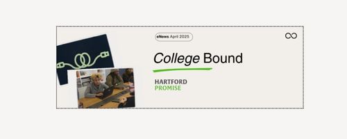

The font selection for the Hartford Promise logo is Alverata Informal, a Serif font. I incorporated one of the brand colors as the tag to complement the logo. Helvetica (LT Pro) is the Sans Serif typeface I selected for headlines and text. It has a clean and simple look that works here and when applied to digital situations.
In terms of business stationery, beginning with letterhead and business cards, I use the above typefaces and left alignment to produce the following. The branded green colors are used as a contrast to the black.
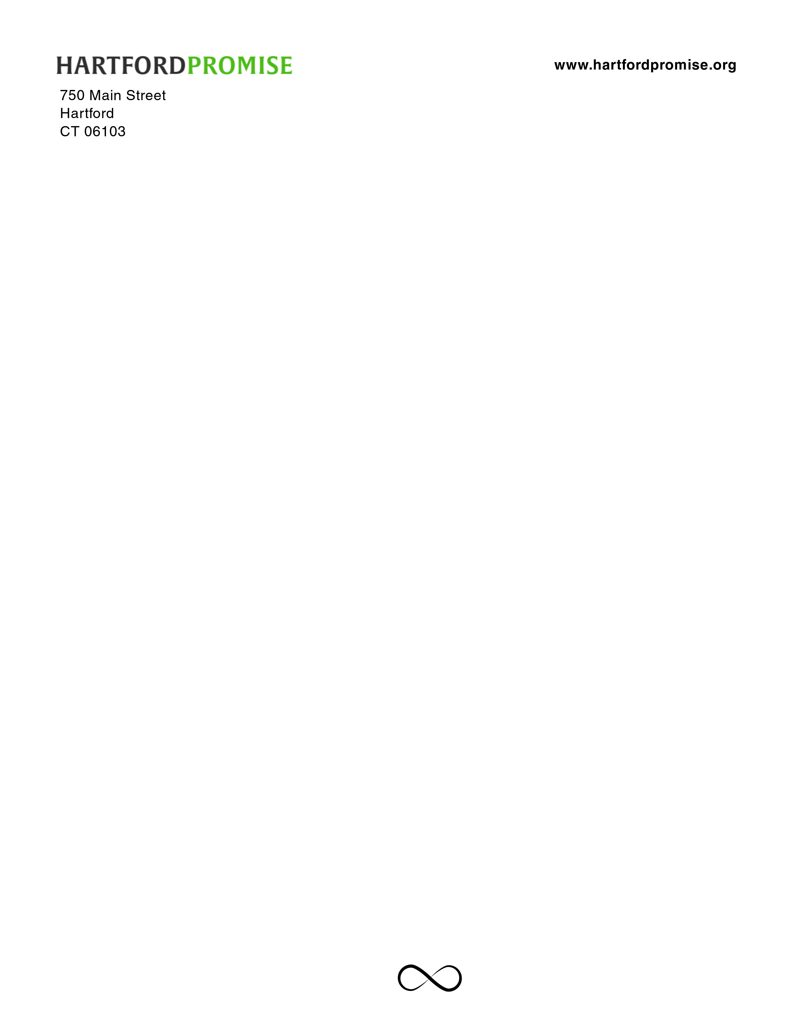
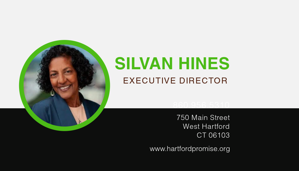

Above are just a few of the essential materials developed to sharpen Hartford Promise’s visual brand.

Responses to blog