
This week’s introduction to data visualization begins with a look at all the ways information can be displayed from bar charts to bubble charts, heat maps to flowcharts, line graphs, scatter plots and infographics. For the most part, the charts represent either an organization’s accomplishments, public or political viewpoints, and human interest stories.
Keeping in mind that good information visualization encourages the viewer to think about substance vs methodology, I began looking at charts developed well-known research and media organizations. A good chart should support what someone is saying or writing about so my perspective is to keep it legible and understandable.
Such as this example from the Guardian: How coronavirus spread globally, using open source information from John Hopkins data repository.
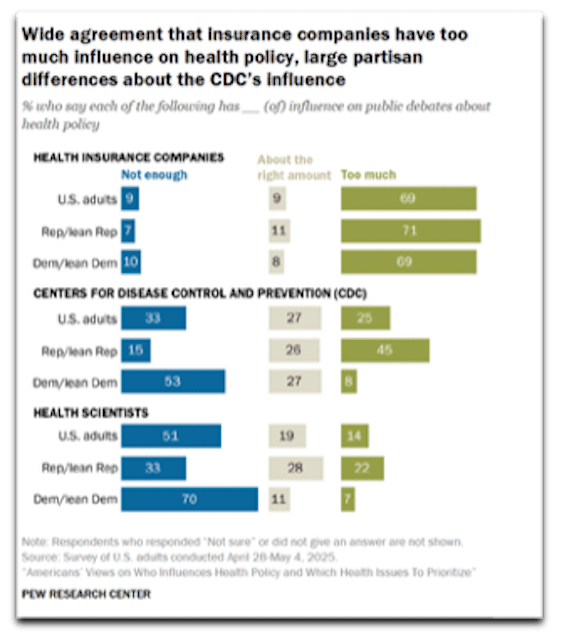
In the following Pew Research example regarding political and public sentiment concerning the degree of influence on public debates about health policy, there is huge bias in the headline and the chart requires scrutiny to find the question, legend and sample size. It misses what Edward Tufte, author of several statistical visualization books recommends in communicating “complex ideas with clarity, precision andefficiency”.
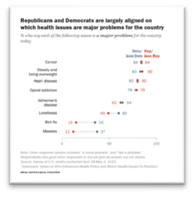
In contrast, the chart on the right efficiently depicts Partisan agreement on top U.S. health issues by displaying a combination of data points and color. Both are shown below for illustrative purposes only:
The upshot of all this data and analysis is we are overflowing with information. Ted Talk presenter Giorgia Lupi who runs a design firm reminds us that the numbers are never the point; it is more about highlighting information to close gaps and bring people closer together. Below she illustrates how she spends her time in extraordinary detail. In contrast to the media and business charts, this is a personal reflection piece that highlights she is generally happy, spends time with her husband and spends time talking on the phone and texting:

To break down information gathering on a personal level, I came up with three questions to track and illustrate over the coming weeks:
- Can I lose a few pounds?
- What does my garden oasis look like?
- What are effective forms of data visualization: media organizations vs. nonprofits?
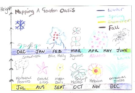
Since you find lots of interesting geometric and informal shapes in nature, I chose to focus my attention initially on capturing potential plants/shrubs, including their common names, when they flower and their preferences for sun/shade. Now I can use this information gathering exercise in conjunction with other landscaping decisions.
Decoding the Ideal Garden
As you see from the initial sketch, the shapes combined with natural and vibrant colors, all contribute to what will eventually become a relaxing garden space, especially when the string lights are hung. I am not much of an artist so in this initial drawing, I only fit about a dozen plantings in this 4″ x 6″ space mapped against four Seasons. In the end, the aim is to have something in bloom each Season:
This exercise seems to be more about capturing daily habits. I have a simple grid structure established on a separate sheet that I will use to track each question and sub-points. Imagining that I’m really going to be mailing 4” x 6” postcards with personal information about the above topics is going to require more ingenuity and sharpening of Oliver’s pencils.

Responses to blog