
The art of data visualization is simplifying information or numbers through the creation of visuals that are easy for the viewer to understand.
Regardless of the type of analysis, knowing the communication goals, audiences, key conclusions and the format or venue is essential before turning anything into easy-to-grasp visuals. Any information captured should also be codified and analyzed:
- Exploratory analysis is an open-ended exploration to advance a business or personal goal. It can be ideation or qualitative feedback that informs what may become a more substantive research initiative. It can also be used after a quantitative study to understand one or two topics in greater detail.
- Statistical analysis is when you have a structured research initiative that yields data that can be presented as accurate within a high degree of confidence. This involves knowing population sizes and calculating required sample sizes. Results are often shared in formal settings.
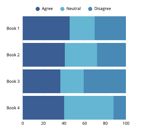
Storytelling with data by Cole Nussbaumer Knaflic looks at a handful of some of the most effective data visual displays:
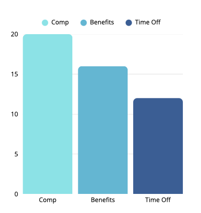
enables comparison between categories.
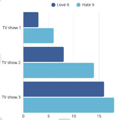
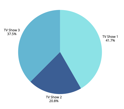
Horizontal Bar Graph: Easier to read because you see labels before the data.

Exploratory Analysis: Dear Data
On the other end of the spectrum to data visualization is the graphing of personal information to reveal insights on habits or preferences. While you can never be definitive in what you conclude from a low volume individualized exercise like this, you can nevertheless create visuals that begin to show patterns over time.
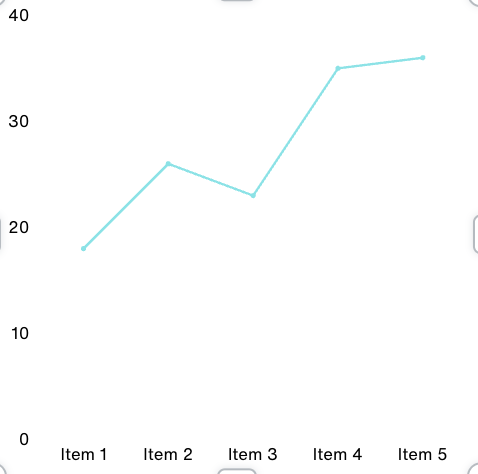
I tracked mealtimes over the course of seven days to see if eating within an eight-hour window helps me to lose a few pounds. While I have found this quite doable, it is too early to say whether this will be an effective form of weight management in the long run.
Line graphs help to visualize information over units of time, in this case over the past week. By using different colors for breakfast, lunch and dinner, you quickly see the mealtime windows.

In the following YouTube presentation by David McCandless, this British data journalist and author demonstrates how presentation style augments what you see. The use of color and ragged mountain edges show the rapid shifts in public sentiment and relative fear factor that has swept over nations during prior national health crises. While he presents other oblique information that adds visual complexity, his relaxed and humorous presentation style makes this work.
There are multiple ways to visualize qualitative information and quantitative data. Which visualizations have you found most effective? By carefully selecting a visual format, you are well on your way to informing or inspiring those you wish to influence. When combined with a convincing speaker who engages the audience, data visualization can bring home a message, add levity or give them something to think about.

Responses to blog