
Using maps as a form of communication helps people determine where things are happening in a geographical context. They are ideal for comparing to other geographies and are frequently used to explain weather patterns and regional differences.
I recently heard a news story about redistricting before a census for the sole purpose of political gain. Maps are central to any political party, especially for analyzing voter demographics and showing people where the new lines fall.
Maps are also invaluable when disaster strikes. They quickly orient those affected by a catastrophe and help people in communities near and far to feel a sense of unity. Take for example the recent Texas floods, which devastated specific counties and captured the nation’s attention for several days.
This CBS news story from July 2025 incorporates several detailed maps to show the most impacted areas.
Dabbling with Datawrapper
It took me time to come to grips with DataWrapper, a powerful online mapping tool. It has an enormous library of maps and geographical presets that make it easy to grab and tailor almost any map.
Below are some of the initial maps I created in DataWrapper, the first one being a choropleth map. This one was the most intuitive to create and enabled the selection of different colors to represent ranges of access:
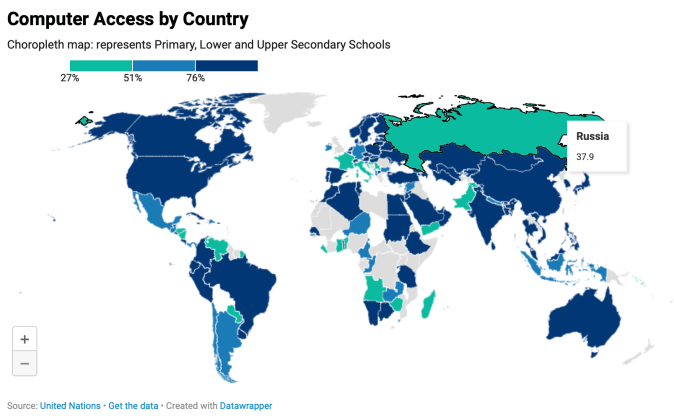
Digital economy: percent of computer access in schools by country.
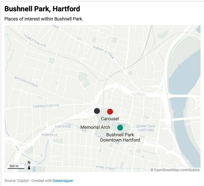
Bushnell Park, Hartford: A locator map highlights three key attractions and a glimpse into the city’s public spaces.
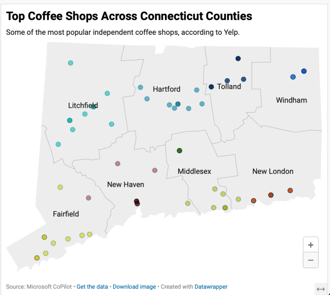
Mapping CT Perkatories: Independent coffee shops provide a convening spot for friends and those looking for ambiance.
While not yet dynamic, you can imagine how impactful these become with more detail and if they were integrated into a mobile app.
My favorite feature in DataWrapper so far is the ability to customize virtually any kind of map. Since this is still exploratory, I selected only three locations of interest and dropped them onto the map in a more approximate versus specific way.
I attempted to add the hover feature to the coffee shop map, adding the name, address and web link and couldn’t make it happen.
Beyond illustrating facts, maps add an element of emotion to any story or news article. From flood zones to voting districts, maps show the bigger picture and help connect its readers to the world around.

Responses to blog